Redesign
Reimaging the shopping experience Amazon
Redesigning Amazon’s mobile experience to reduce complexity and improve usability





Amazon App Redesign – Bringing Order to a Cluttered Shopping Experience
UX Research · UX/UI Design · Prototyping
Design Practice Project
The project in brief
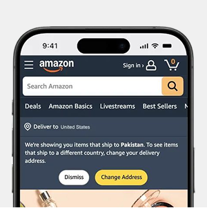
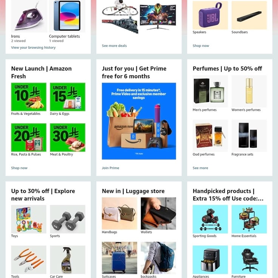
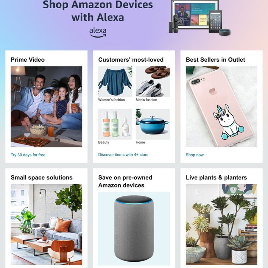
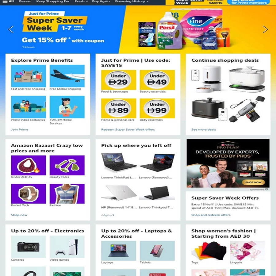
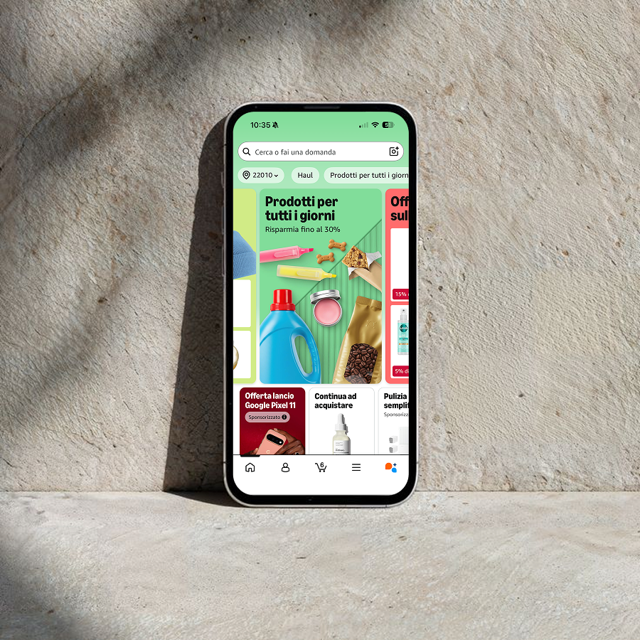
Amazon’s app is one of the most used shopping apps in the world, and one of the most criticized for how it feels to use. The business itself performs well: conversion is strong, the catalogue is unmatched, logistics are seamless. The interface tells a different story, though: home, search results and product pages are saturated with promotional banners, sponsored content, recommendation carousels and secondary CTAs competing for the same inch of screen, often at the expense of the one thing a shopper actually came for, finding a product quickly and trusting the choice.
This project is a full UX/UI redesign of the Amazon app, built around one guiding question: how much of that visual noise is actually necessary, and what would the experience look like if clarity, not density, became the priority?
Understanding the brief
Before touching any screen, the starting point was to reframe this as a real design brief: not “make Amazon prettier,” but “reduce cognitive load without touching what already works.” Brand recognition, trust and catalogue breadth are assets, not problems, so the brief stayed scoped to interface and information hierarchy, deliberately keeping the existing color identity, typography logic and core navigation model intact. Redesigning UX doesn’t always mean starting from zero; sometimes it means having the discipline to decide what not to change.
Business goals and competitor analysis
Working backward from a realistic business perspective, the redesign was anchored to goals any e-commerce platform cares about: higher conversion, shorter time-to-purchase, and better retention through a more trustworthy, less fatiguing experience, without sacrificing the ad and recommendation inventory that funds the platform.
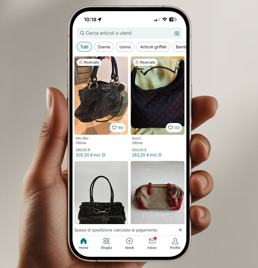
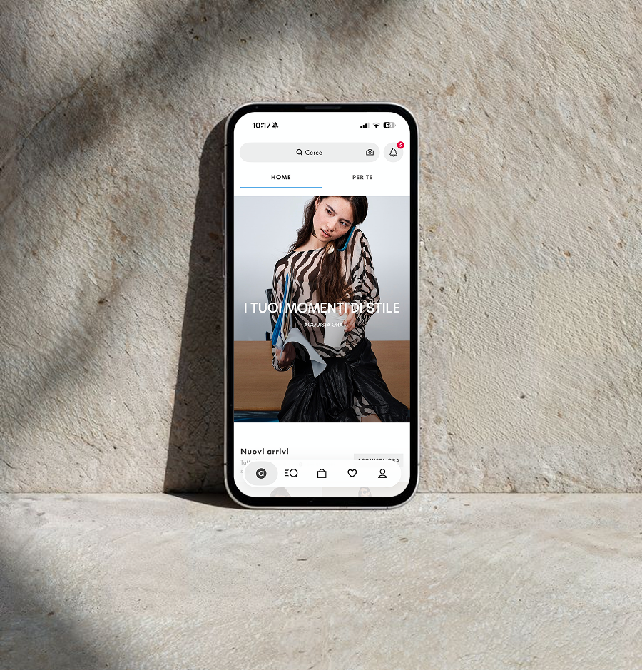
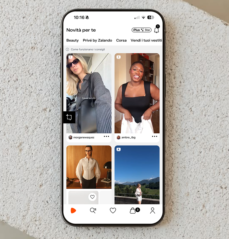
To calibrate that balance, I looked at how Shein, Zalando, Temu and Vinted handle the same tension between commercial density and usability, from cleaner card grids to more restrained use of color for commercial content versus core UI, a useful benchmark for how much “noise” a shopping app can carry before it works against its own conversion goals.
Defining the problem
App store reviews consistently surface the same frustrations: users describe the homepage as overwhelming, struggle to tell organic results from sponsored ones, and often can’t tell at a glance which section they’re in. Heavy reliance on stacked carousels and banners makes scanning slow and browsing fatiguing, especially for less tech-confident users. Three core problems emerged to guide every decision that followed:
- Passive discovery — the app pushes content at users instead of helping them explore with intent.
- Flat visual hierarchy — everything competes for attention, so nothing stands out.
- Invisible personalization — recommendations exist but don’t feel tailored or explained.
User research and personas
To ground the redesign in real behavior rather than assumption, I built on existing research into online shopping habits and re-categorized established product-discovery theories, how users move between searching (I know what I want), browsing (I’m open to suggestions) and exploring (I want to be inspired), mapping each mode to a specific pain point in Amazon’s current flow.
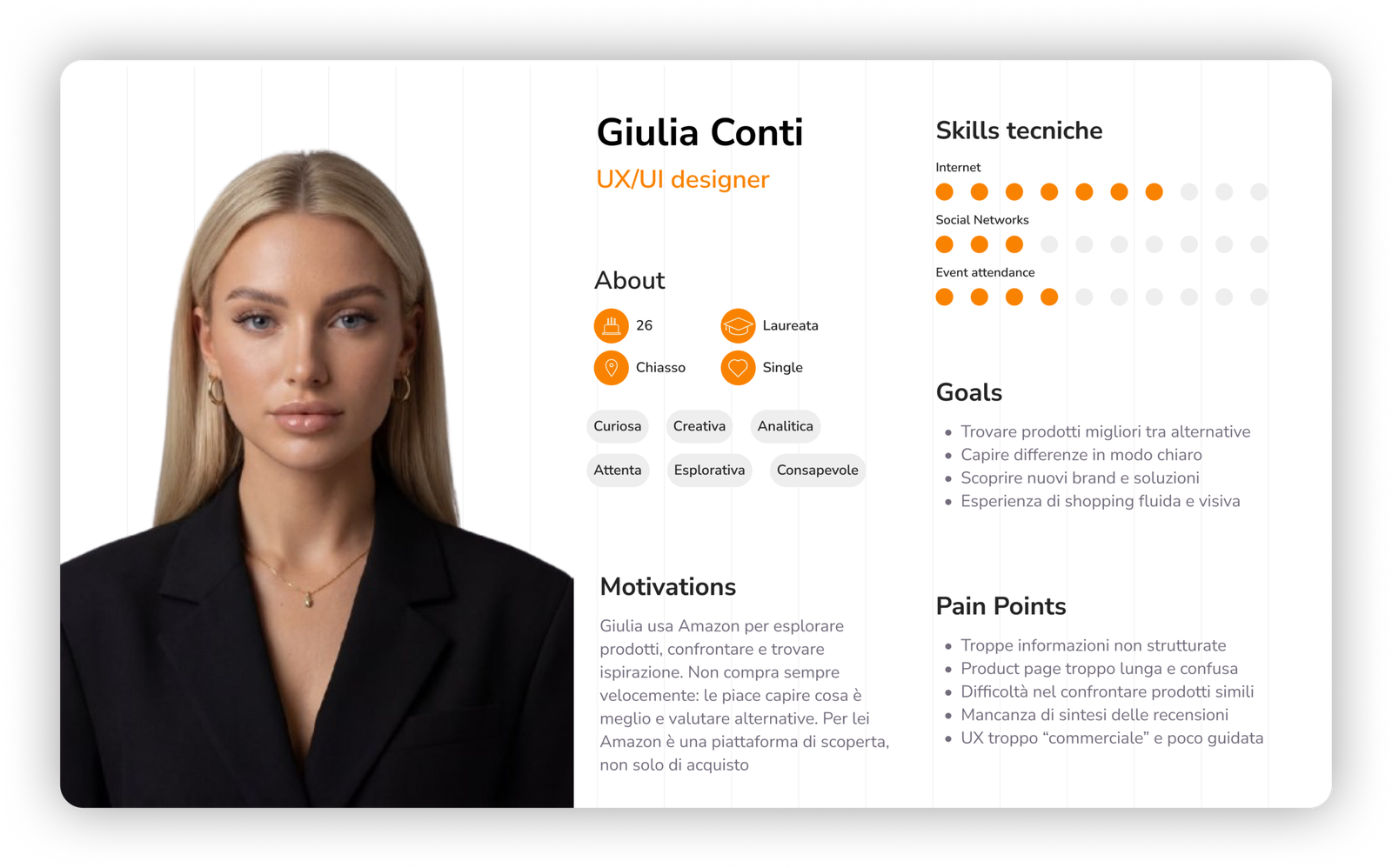
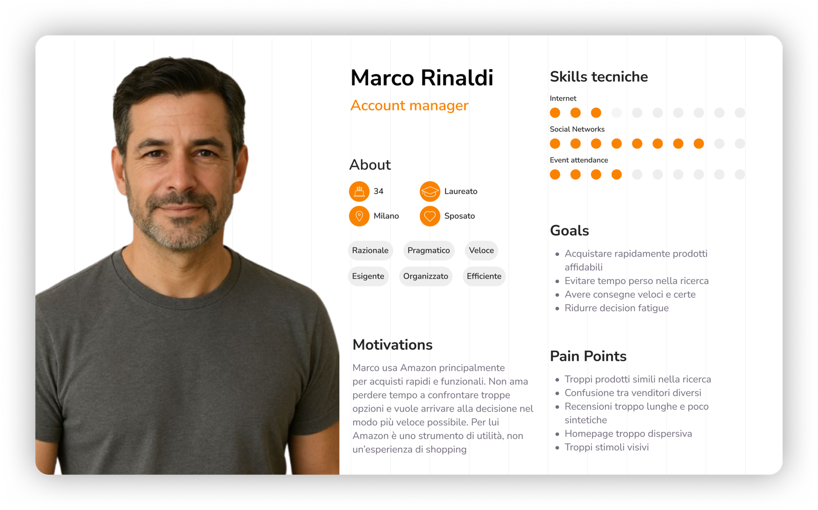
From this, I developed personas covering the app’s core segments: the goal-oriented shopper who wants to search, compare and buy in minutes, and the browsing-driven user who opens the app with no fixed target and expects the interface to guide discovery. These two priorities, speed and precision versus curation and inspiration, made clear that a single, undifferentiated homepage couldn’t serve both well.
User flow, requirements and information architecture
I mapped the core flows, open-app to purchase, and open-app to discovery, to pinpoint where friction came from competing UI elements rather than the flow itself. This fed a lightweight Business Requirements Document translating the problems into concrete, prioritized requirements: a clearer split between personalized and sponsored content, a home structured around explicit browsing modes instead of an undifferentiated feed, and an always-accessible entry point to search.
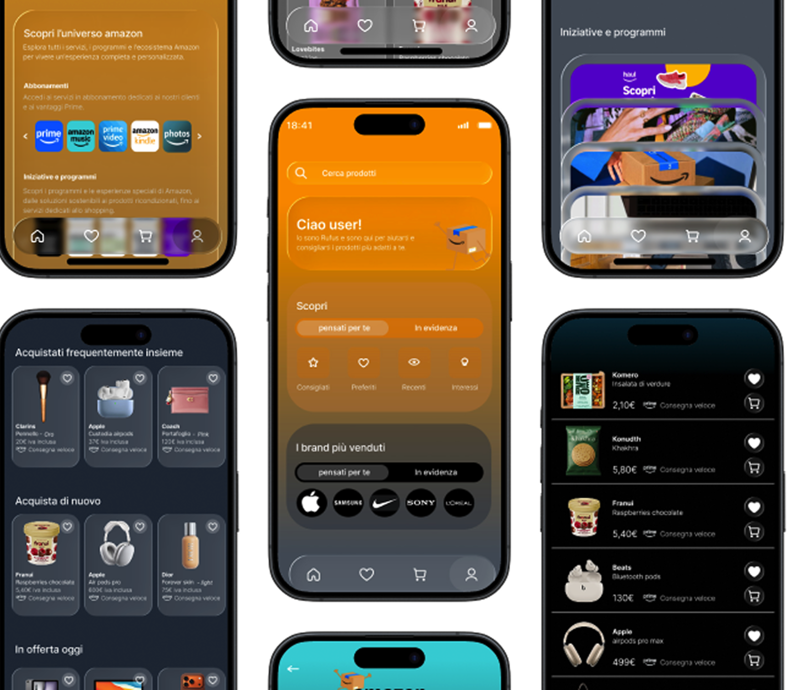
The resulting information architecture reorganizes the homepage into distinct, labeled zones: intent-driven discovery (“for you” vs. “featured”), interaction-based browsing (recommended, favorites, recent, interests), and a merchandising zone for top brands, replacing Amazon’s current stack of loosely related modules.
Visual foundations
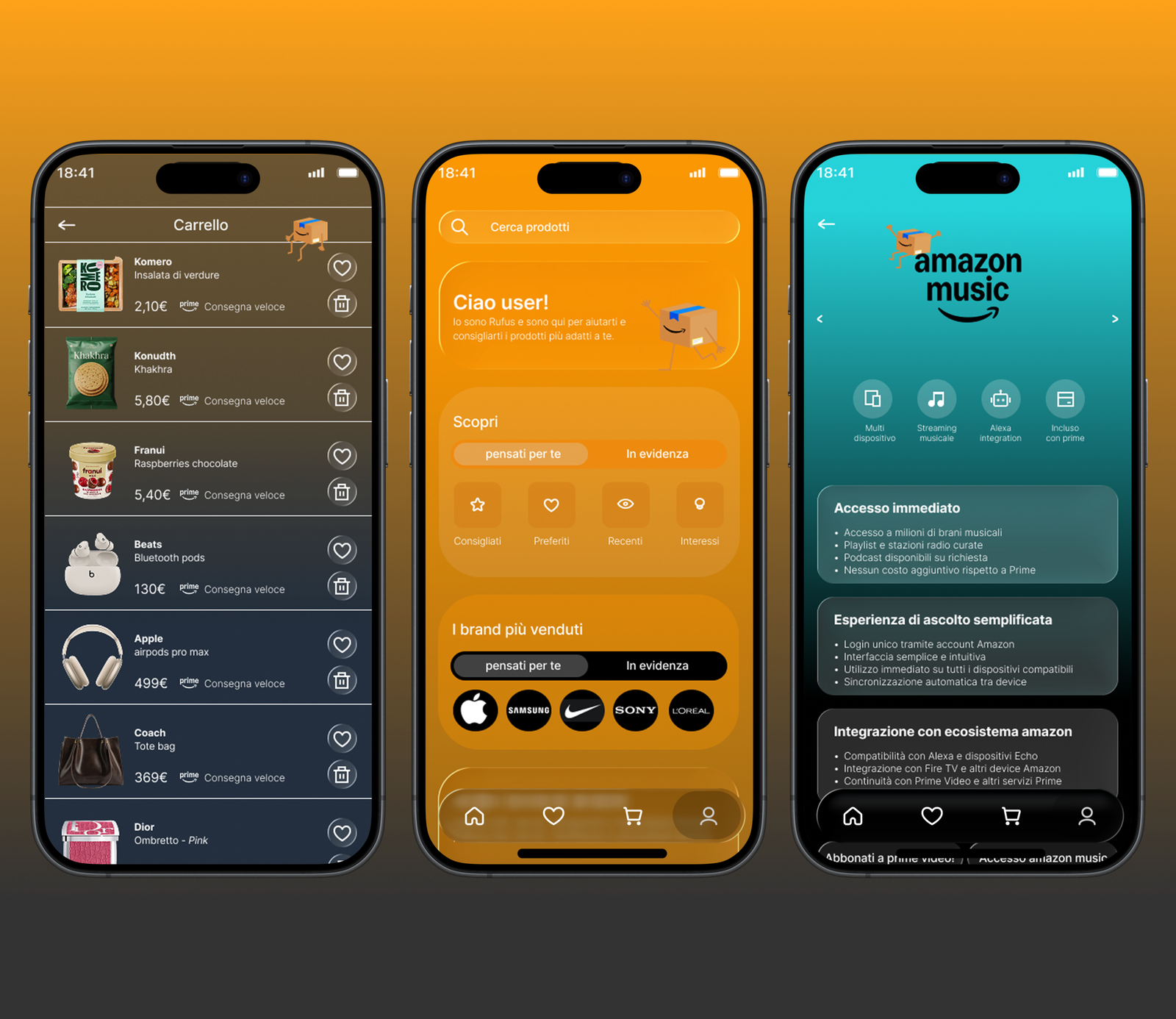
With color identity and typography intentionally preserved, this phase focused on how to use them more purposefully rather than replacing them. The moodboard turned Amazon’s warm orange from constraint into opportunity, building a softer gradient from orange into deep charcoal, anchoring the top of the screen (search, personalization) while giving the lower portion a calmer, more premium tone (browsing, brand discovery), instead of a flat orange repeated throughout.
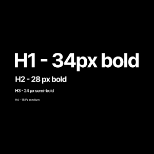
Typography and base UI components stayed consistent with the existing product to protect brand recognition, the redesign works within Amazon’s visual language, not against it. In parallel, I sketched an improvised logotype for the mascot introduced below, giving it a distinct signature without breaking from the parent brand.
Giving the AI assistant a face
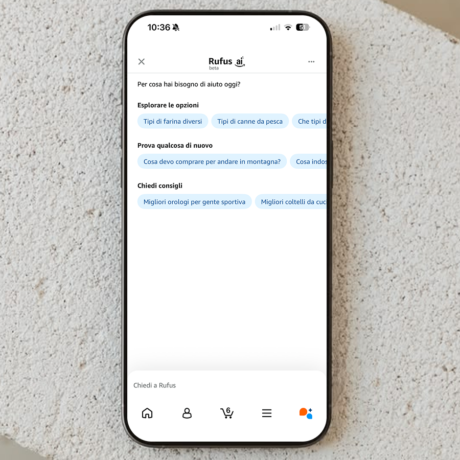
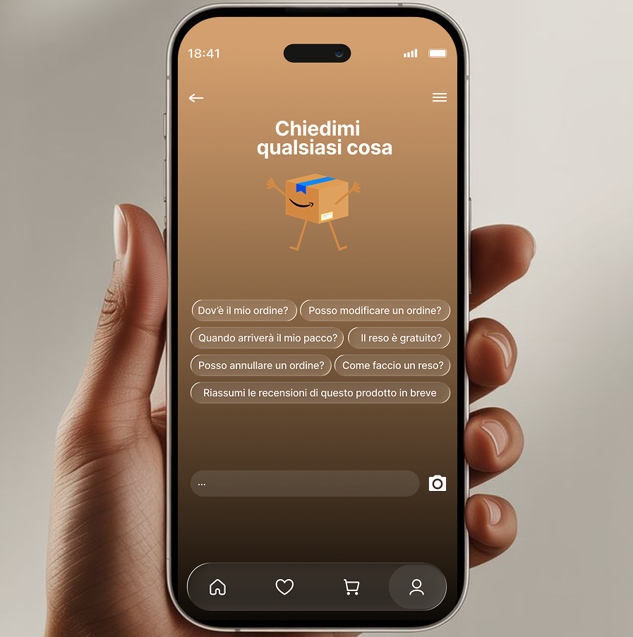
One of the most deliberate decisions in this project was giving Amazon’s AI shopping assistant an actual visual identity. Today, AI-driven recommendations are functionally present but visually invisible, buried in generic UI, easy to miss and hard to trust.
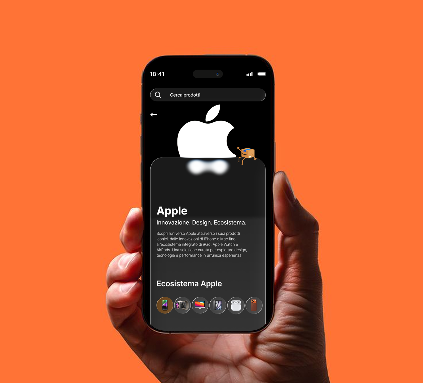
To fix this, I designed a small mascot, a friendly, animated shipping box with arms and a wave, to embody the assistant and give it a face users can recognize. It appears throughout the app in different positions depending on context, introducing itself by name (“Hi, I’m Rufus, I’m here to help you find the products that are right for you”) in a tone that’s helpful rather than salesy. Personifying the AI this way does two things at once: it makes personalization visible and legible instead of algorithmic and hidden, and it gives the app a distinctive, ownable visual asset no competitor has.

Inspiration research, wireframing and low-fidelity prototyping
Before locking in layout decisions, I researched shopping and lifestyle apps with strong discovery patterns, how they use tabbed browsing, icon-based filtering and card hierarchies to keep dense catalogues legible. This informed the wireframes: search bar, assistant appearance, tabbed discovery section, icon-based browsing grid, brand carousel and bottom navigation, sketched at low fidelity to validate the information architecture before any visual polish.
The low-fidelity prototype tested the core interaction logic, can users move between “for you” and “featured” content without confusion, and does the four-icon grid (Recommended / Favorites / Recent / Interests) read as distinct entry points? Several rounds of iteration followed, refining spacing, grouping and section order based on how a first-time viewer’s eye moved down the screen.
UI design and final mockups
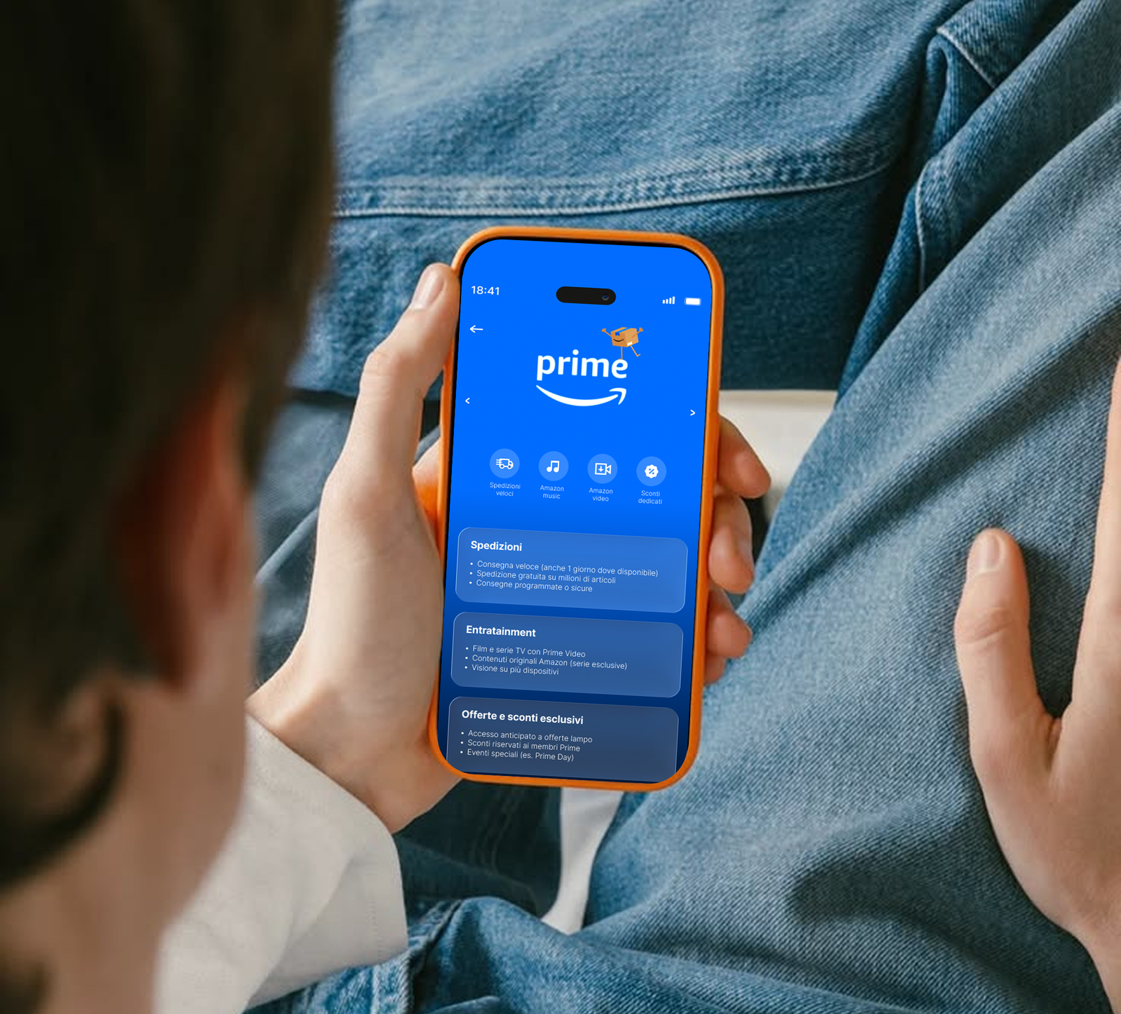
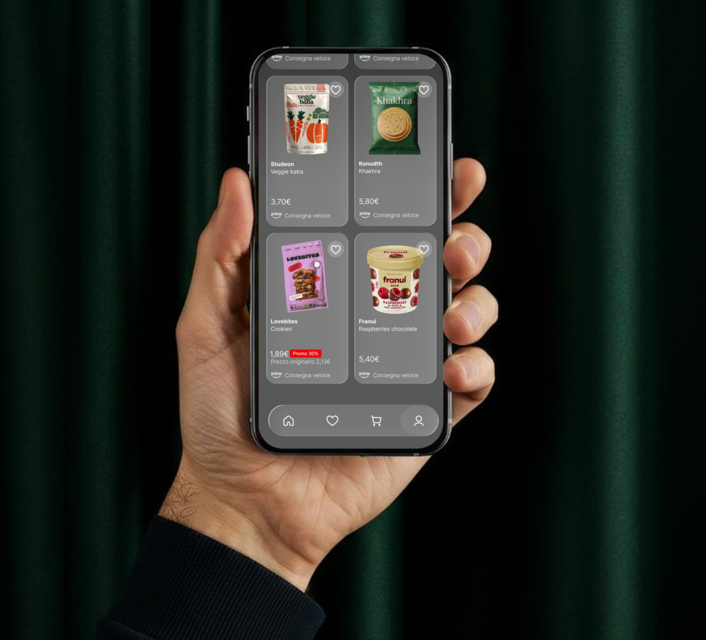
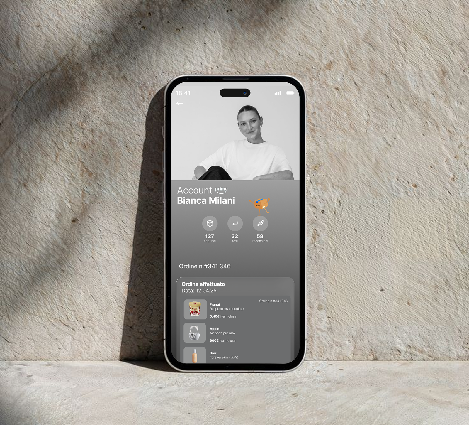
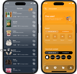
The final UI translates all of this into a cohesive, high-fidelity interface: a rounded, high-contrast search bar anchored at the top; Rufus introducing the assistant in a warm, conversational tone; a “Discover” section with a segmented control switching between for you and featured; a four-icon browsing grid for intent-based navigation; and a “Best-selling brands” module on a darker background to visually separate merchandising from personalized content, all tied together by the gradient system, and closed by a simple four-item bottom navigation (Home, Favorites, Cart, Profile) within thumb’s reach.

Usability testing and accessibility
The prototype was tested against the redesign’s central hypothesis: clearer hierarchy and explicit labeling reduce the time and effort needed to find something relevant, whether searching with intent or just browsing, while catching any regressions the new structure might introduce.
Accessibility was a core requirement from the start, not a final check: contrast on the orange-to-charcoal gradient was validated against accessibility standards, touch targets in the icon grid and bottom nav were sized for reliable tapping, and every icon carries a text label rather than relying on iconography alone, a small but important choice for an app used across such a wide range of ages and digital literacy levels.
What this project was really about
Redesigning an app as established as Amazon isn’t about reinventing it — it’s about deciding, deliberately, what deserves visual weight and what doesn’t. This project treated clarity as a design feature in its own right, and used the AI assistant to make personalization something users can actually see and relate to, rather than an invisible layer running in the background. A reminder that even a product used by hundreds of millions of people has room for a more human, more legible interface.