UX/UI DESIGN
Take your time. Breakslow!
Creating a travelling brunch experience where the destination is only part of the story.

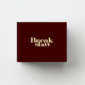
BreakSlow – An Itinerant Brunch Brand Born to Fill a Gap
Brand Strategy · Visual Identity · UX Research · UX/UI Design
Independent Project – Learning & Development
The project in brief
BreakSlow was born from a precise market observation: on one hand, experiential pop-ups, temporary events that change location and run for a limited time , are one of the best-performing formats today, precisely because of their immediacy and their ability to generate desire through scarcity; on the other, the experiential trend is redefining what consumers expect from any moment of consumption, food included, shifting value from the product to the experience lived around it.
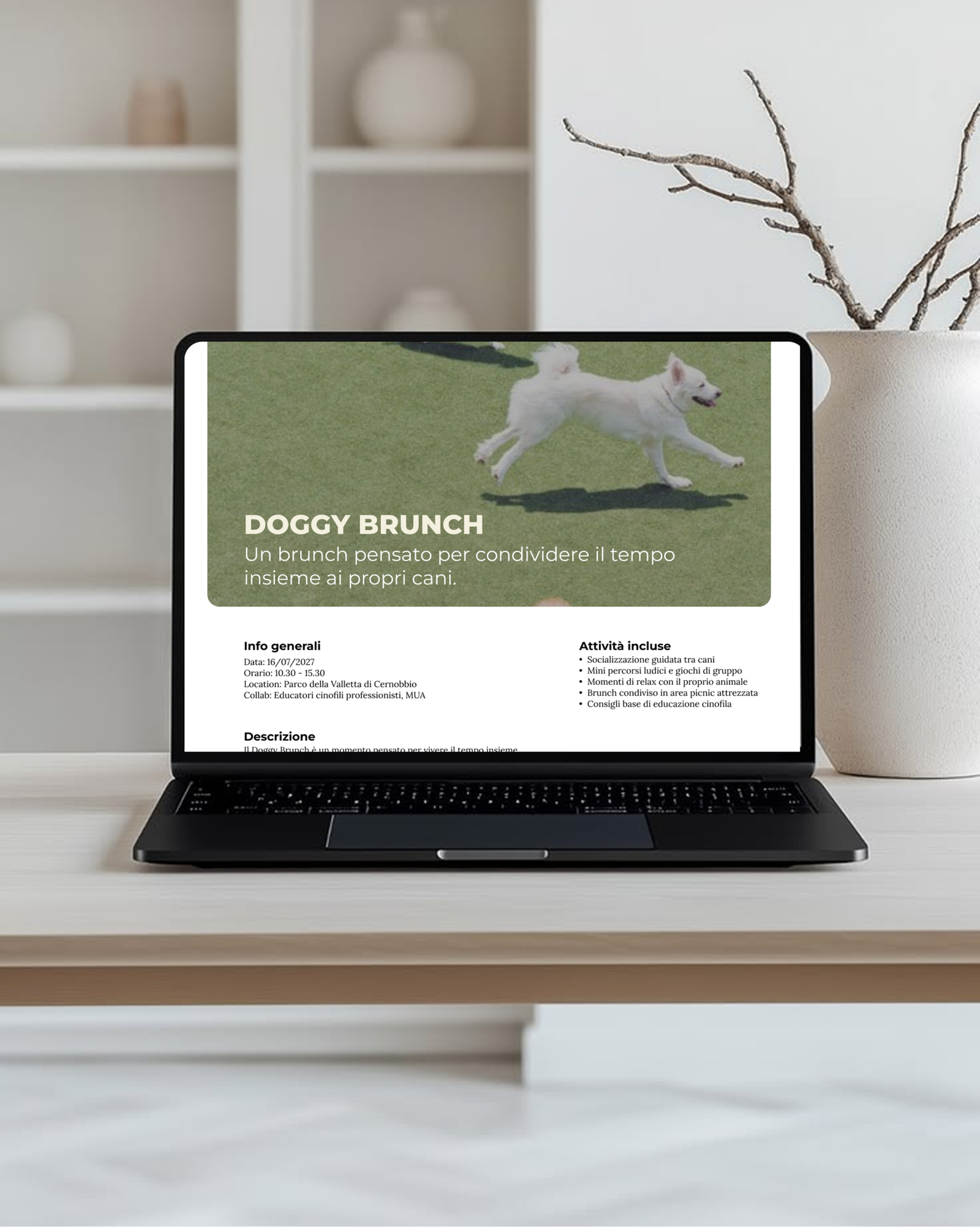
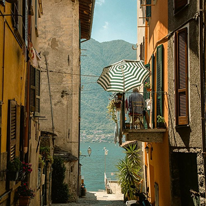
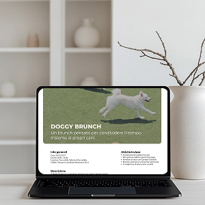
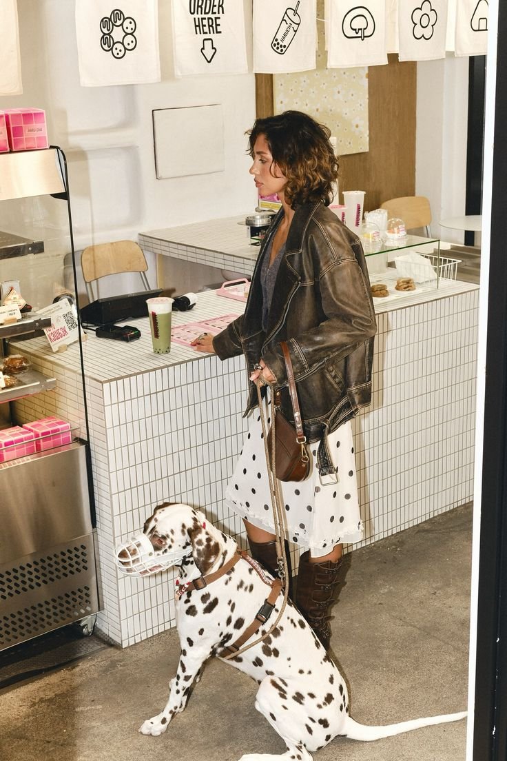
From here came the idea: an itinerant brunch brand that merges these two phenomena, bringing curated brunch experiences to locations and formats that are always different, often completely disconnected from one another, a villa on Lake Como, a ceramics workshop where participants shape their own brunch cup, a meet-up for a specific dog breed run in collaboration with a pet clothing brand, or a pop-up within the pop-up, hosting the launch of a new fashion label inside a BreakSlow event, always with limited seats and mandatory booking through a website. The project covers the full journey, from market research to brand identity, through to the UX/UI design of the booking website.
The market gap: why BreakSlow
The idea grew out of upstream trend analysis and research: on one side, the observation that pop-up formats, temporary, mobile, limited-availability by definition, systematically generate more attention and desire than fixed formats, precisely because they force a quick decision; on the other, the rise of experiential consumption, where audiences no longer look for just a good product, but for a moment worth telling.
In the Italian food landscape, these two trends almost always stay separate: brunch is nearly always a fixed format tied to a venue, while experiential pop-ups, when they exist, rarely revolve around brunch. BreakSlow was built exactly in that gap: a brand that doesn’t sell a venue, but an itinerant experience, built each time around a place, a moment, and a different set of collaborations.
The concept: what BreakSlow is (and isn’t)
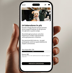
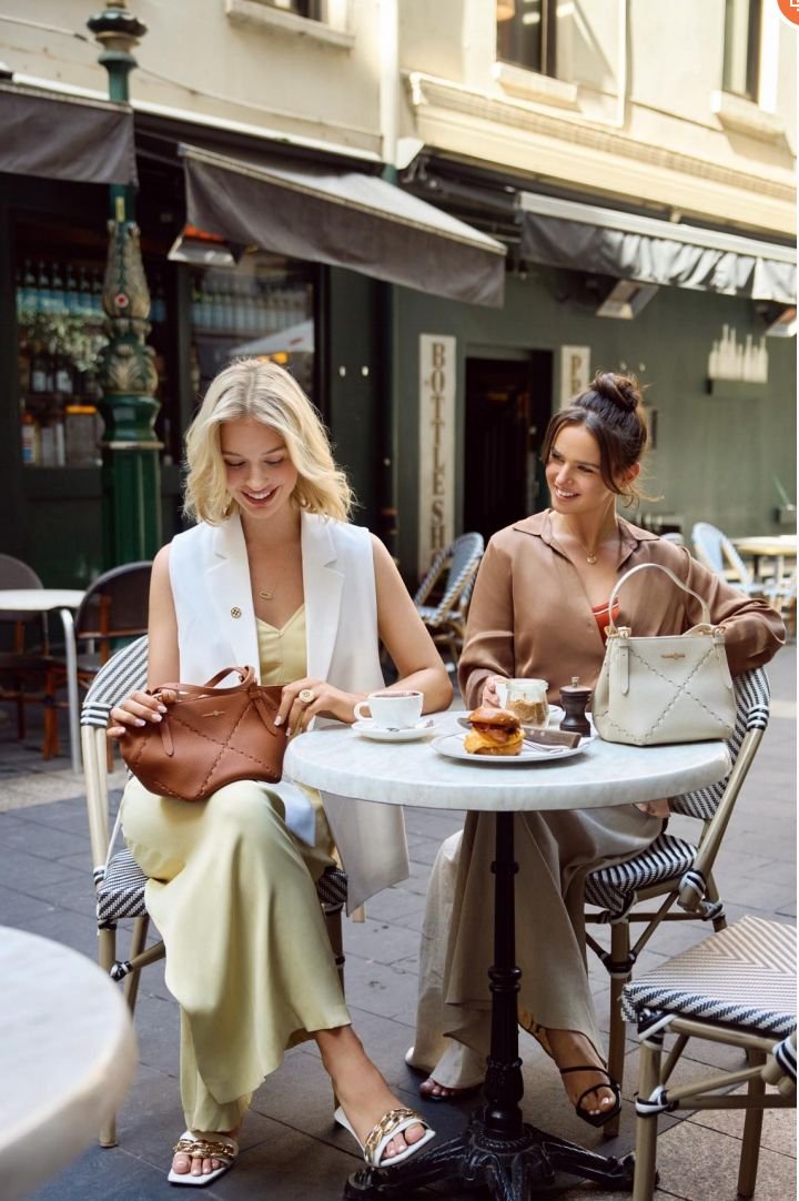
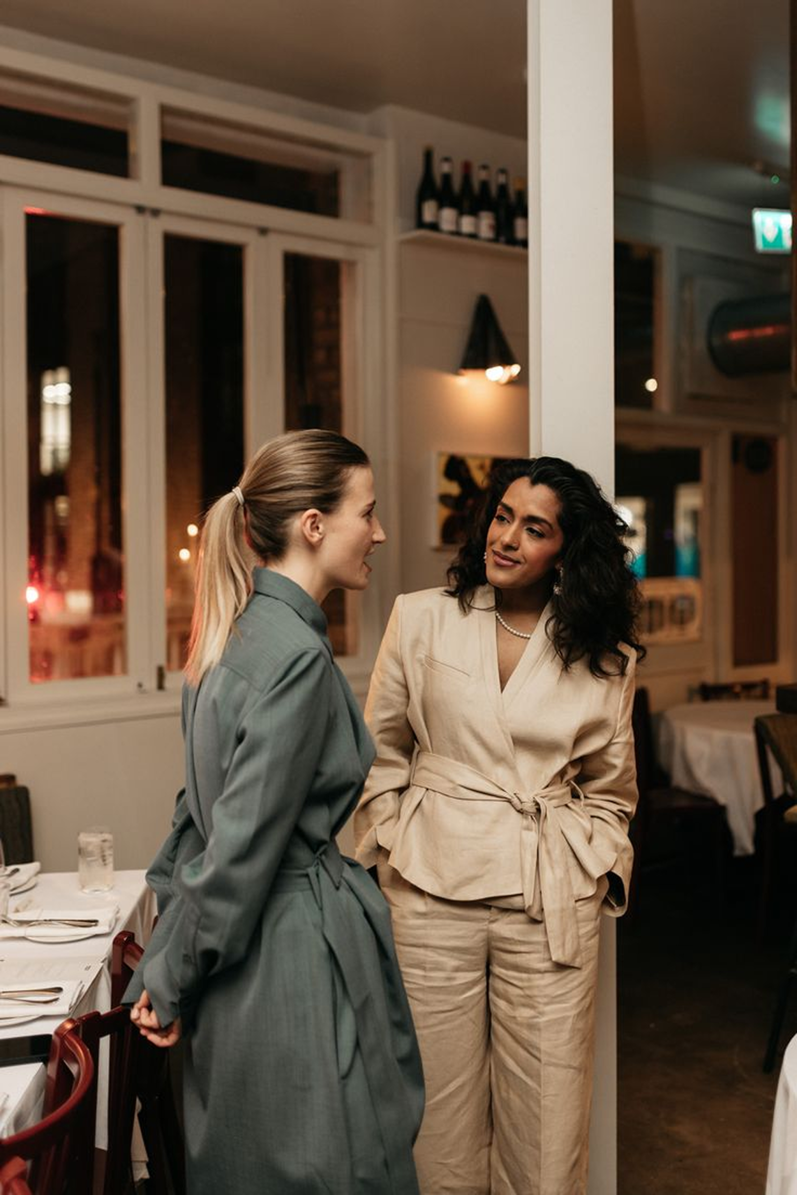
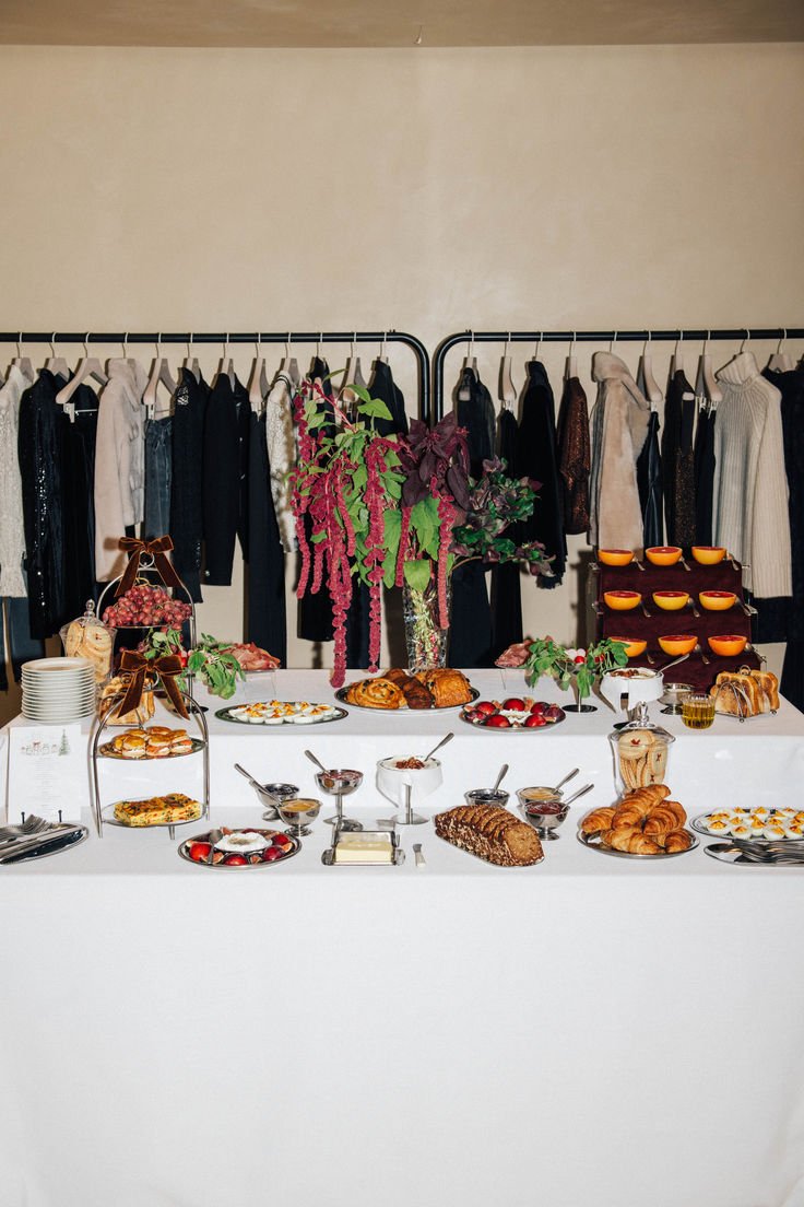
BreakSlow is an itinerant brunch brand operating across Lombardy and the Swiss border area, organizing events across locations and formats that are always different, rarely traceable to a single recurring theme: the terrace of a villa on Lake Como with a lakeview brunch; a craft space where the brunch is woven into a ceramics workshop, with participants shaping their own cup before using it; a meet-up dedicated to lovers of one specific dog breed, built in collaboration with a pet clothing brand; or a pop-up within the pop-up, where an emerging fashion label chooses a BreakSlow event as the stage for its own launch. Every event has limited seating, is set up specifically for the occasion, and is only accessible through a website booking.
The key point, though, is that the brand’s focus isn’t brunch itself, nor any single type of collaboration, but the sharing and the experience built around it: BreakSlow collaborates with any type of brand, not just food-related ones because the goal is to build moments, not simply serve a meal. Every event stands as its own project, often completely disconnected from the previous one in theme, location and partners involved: it’s precisely this unpredictability, rather than a repeated formula, that keeps the model scalable and the brand relevant event after event.
Naming and narrative concept: slowness as a promise
The name BreakSlow merges two ideas: break, the pause from everyday life, and slow, the unhurried pace that defines every event. It’s an explicit promise to an audience living at a frantic rhythm, looking, even just for one morning, for a moment suspended from reality.
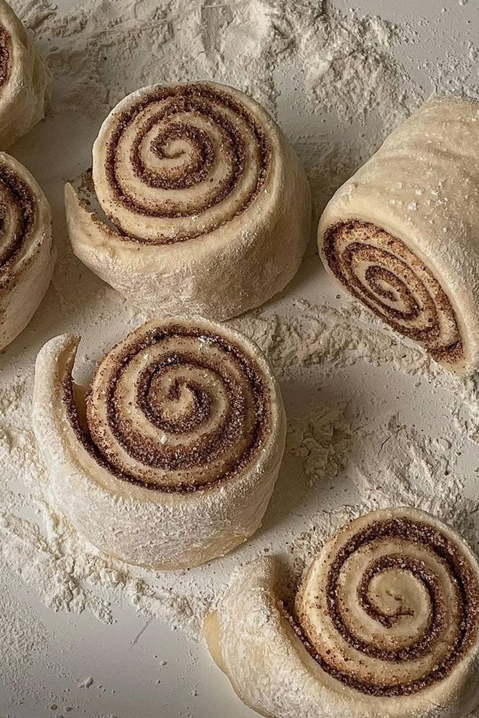
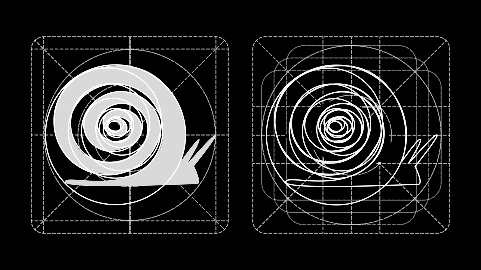
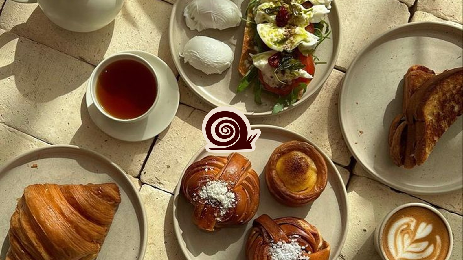
This idea of slowness became the guiding code for the entire visual identity, starting with the symbol chosen for the logo: a snail. A creature that moves, just like the brand, which is itinerant, but does so at its own pace, carrying its home along with it: an image that perfectly captures BreakSlow’s positioning, an experience that moves from place to place while always staying true to itself.

Research and audience validation
Before moving into visual identity, I ran a research phase to validate who was actually interested in this kind of experience, defining three user personas representing the target segments: a more corporate profile, drawn to socializing and networking in curated settings; a profile tied to digital communication, seeking photogenic locations and experiences worth sharing on their own channels; and a younger profile, driven by the discovery of exclusive events and a desire for community belonging.
All three personas share a common trait, the search for authentic, exclusive, “instagrammable” experiences rather than just a meal, but differ in discovery channels, motivations and pain points (from a lack of genuinely original events to difficulty finding clear information on where and when to attend). This work shaped both the brand’s communication choices and, later, the site’s architecture.
Visual identity: moodboard, palette and typography
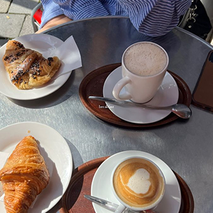
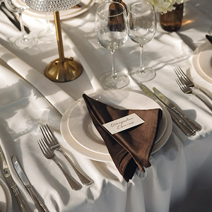
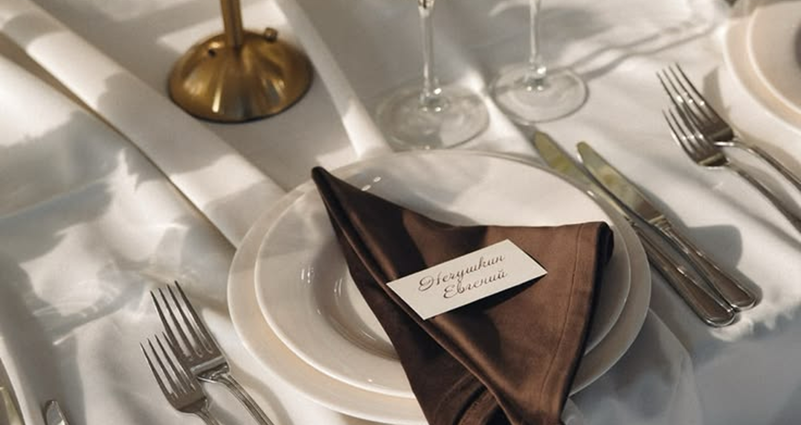
The moodboard brings together the visual elements that tell BreakSlow’s positioning: carefully styled breakfasts, lakeside locations, chocolate textures, elegant fabrics and table settings, alongside more informal, everyday details like a Milan tram or coffee foam, a balance between the quiet luxury of the locations and the authentic informality of a shared brunch.
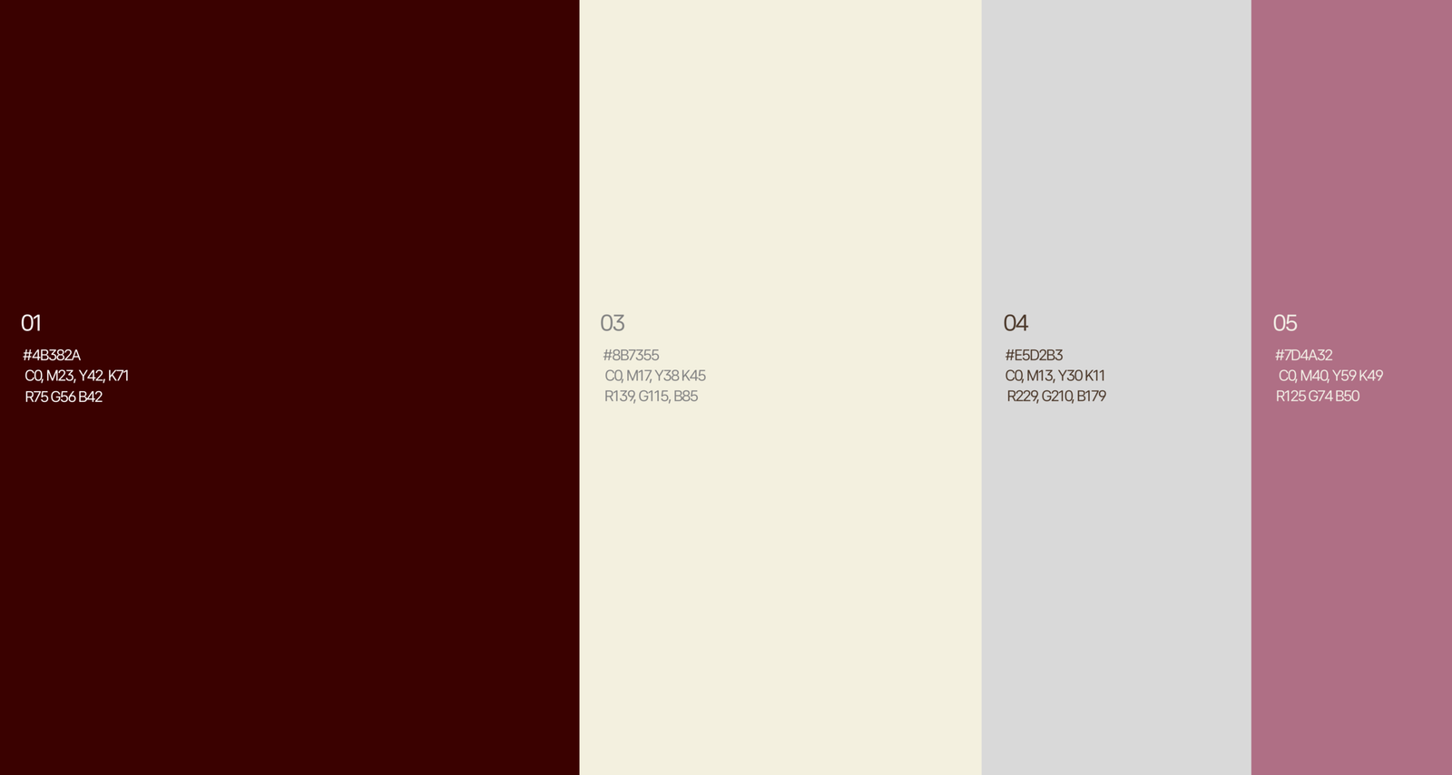
The color palette is built on four tones: a deep, warm bordeaux as the dominant color, a light, enveloping cream, a neutral supporting grey, and a dusty rose adding a more contemporary, feminine touch. A combination that communicates warmth and elegance without tipping into formality.
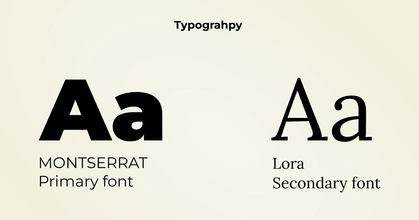
The typography relies on two fonts: Montserrat as the primary font, for solidity and readability in functional content, and Lora as the secondary font, a more elegant, editorial serif used to reinforce the brand’s narrative, more intimate tone.
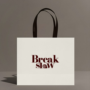
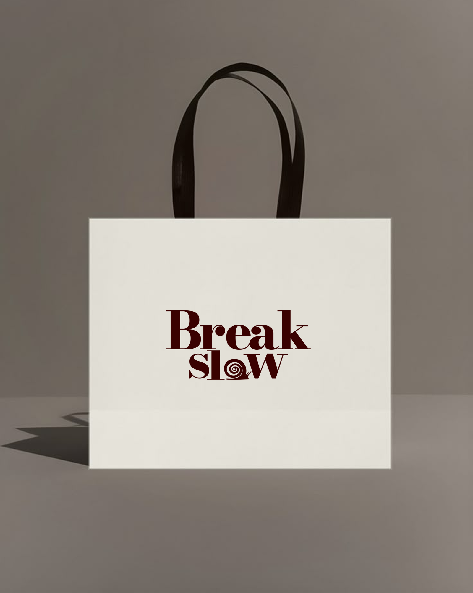
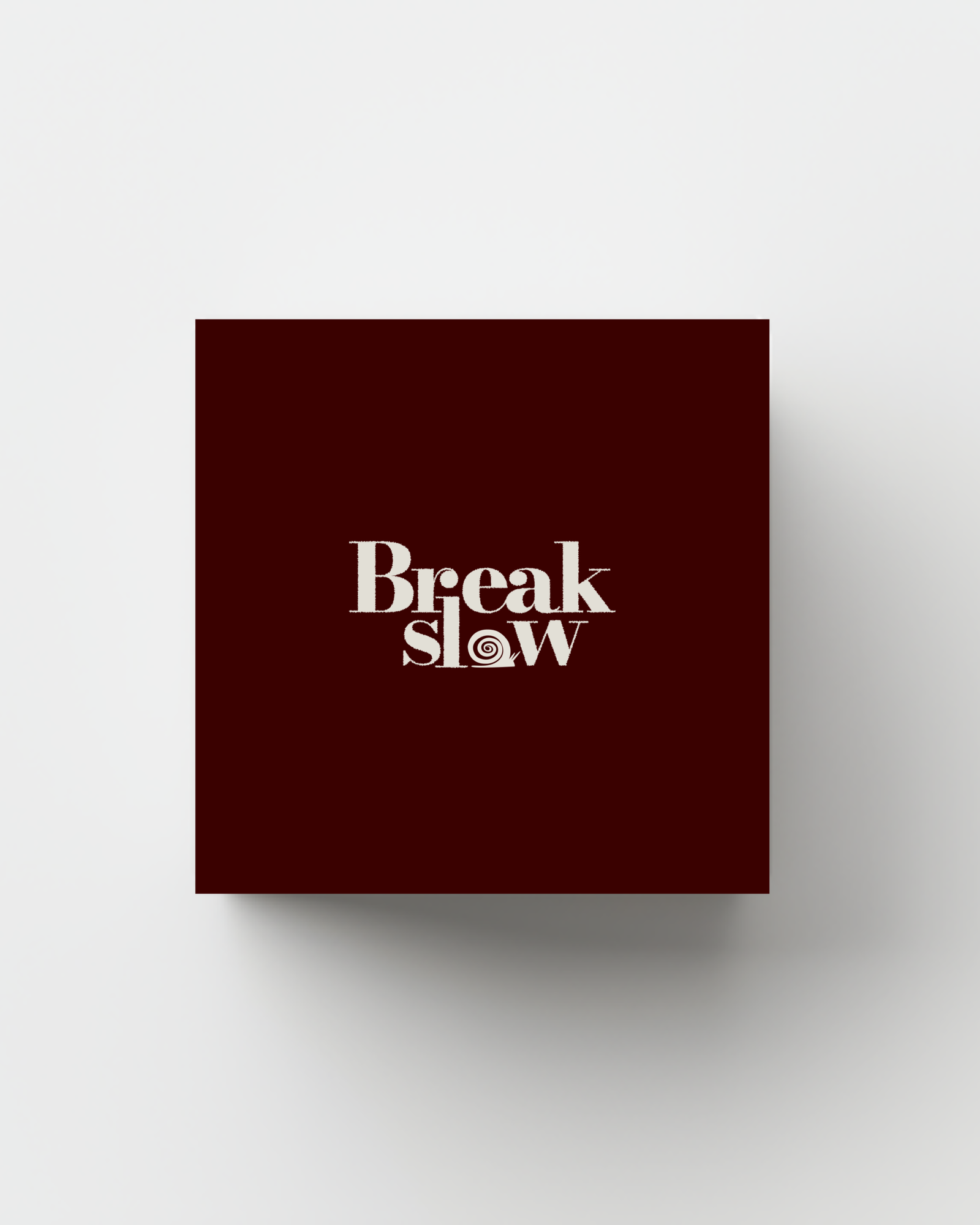
The logo grew out of studying the snail symbol: after several iterations on how to keep the shell’s spiral recognizable even at small sizes, the final mark was integrated directly into the lettering, becoming the “S” of the “Break Slow” wordmark, a detail that makes the logo distinctive and immediately tied to the concept of slowness, rather than remaining an icon disconnected from the name.
Brand applications
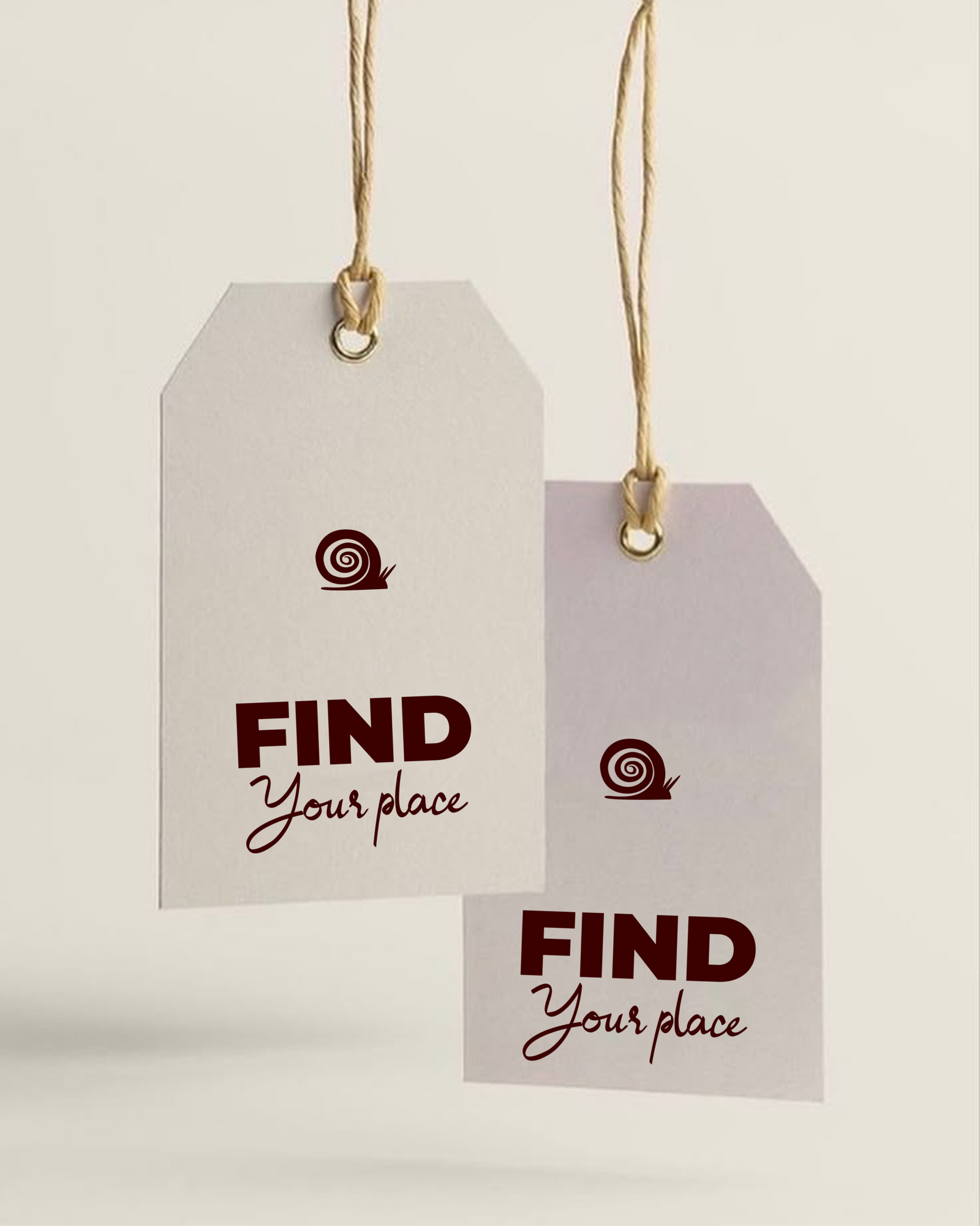
The identity was tested across real applications to check its consistency across different touchpoints: from the take-away box packaging for events, carrying the wordmark large in a calligraphic style on a natural background, to the brand presentation card on a bordeaux background with cream lettering, to the “Slow moments” graphic signature, a cursive variant of the tagline, designed for social and promotional materials where a more personal, less institutional touch is needed.
UX research and UI: the event booking website
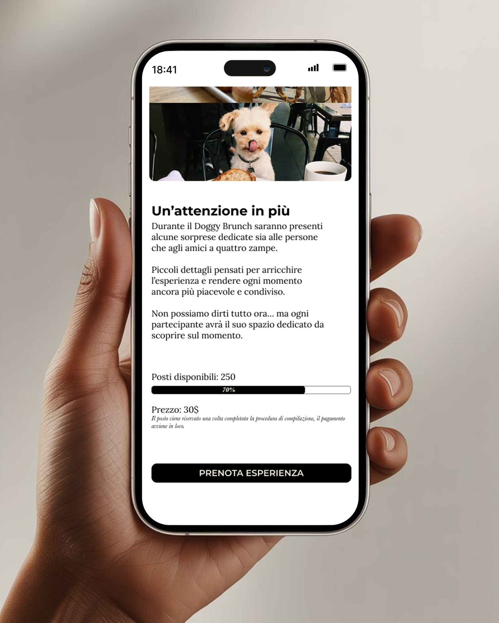
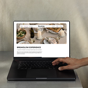
Beyond brand identity, I also handled the UX/UI design of the BreakSlow website, built to answer a very specific need of the business model: since every event has limited seating, a different location, and often a completely different nature from the one before it, a brunch paired with a ceramics workshop has nothing in common, in content or target audience, with a dog-breed meet-up or a fashion label launch, the site needed to let users quickly understand what was coming up, where and when, without confusing one experience for another, and complete a booking with no friction.
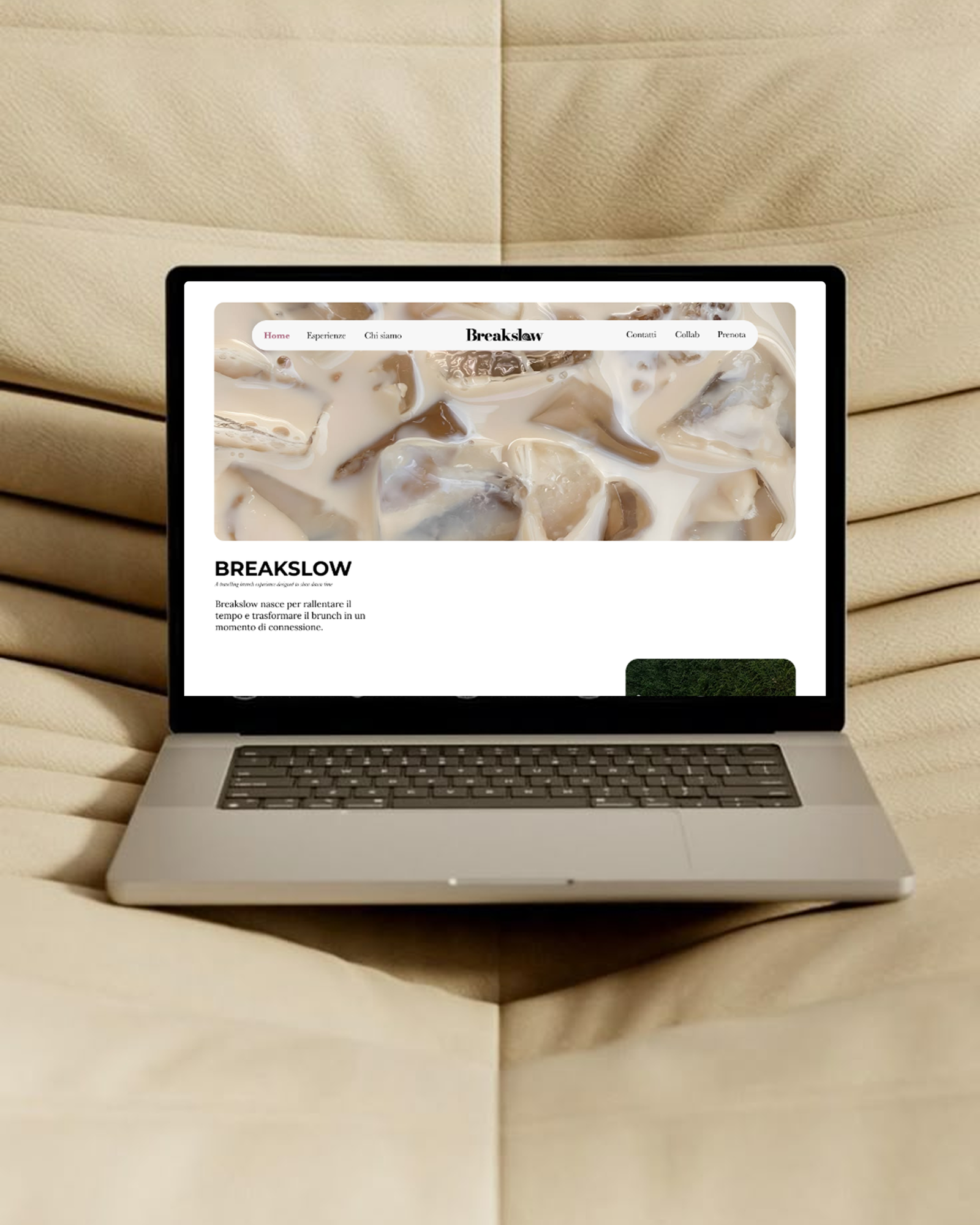
The information architecture reflects this priority with an essential navigation, Home, Experiences, About us, Breakslow, Contact, Collab, Book, that keeps the path to booking always visible and accessible, in line with what emerged from the personas: the target audience doesn’t want to browse for long, they want to quickly understand if the experience is for them and book it.
The homepage was built as a story in three beats. It opens with a visual hero that immediately communicates the brand’s atmosphere, paired with a tagline that sums up the positioning (“A traveling brunch experience designed to slow down time”) and an opening paragraph introducing the mission. This is followed by a section dedicated to the brand’s story (“Our story”), explaining the why behind BreakSlow, and a philosophy section making the guiding principle explicit, slowing down to reconnect, before arriving at the section dedicated to brand collaborations, closed by a direct call-to-action to book.
The prototype went through several iterations on the hero section layout, testing variations in image arrangement and the balance between text and visual content, to find the right equilibrium between aesthetic impact, essential for a brand that lives on atmosphere, and informational clarity, necessary for a site whose primary job is generating bookings.
A format built to never repeat itself
To validate the concept, I developed several applied scenarios, deliberately disconnected from one another in location, theme and partners involved, proof of just how much the BreakSlow model relies not on a fixed formula, but on the ability to reinvent itself event after event. A brunch set up on the terrace of a villa on Lake Como, with lake views and a bespoke setup; a brunch hosted in a craft space where the shared meal is woven into a ceramics workshop, with participants shaping their own cup before using it; a meet-up dedicated to one specific dog breed, built in collaboration with a pet clothing brand; a pop-up within the pop-up, where an emerging fashion label chooses a BreakSlow event as the stage for its own launch.
However radically different, these scenarios share the same underlying structure, limited seating, bespoke setup, mandatory booking, and the same consistency between brand promise, physical experience and digital touchpoint. It’s precisely this ability to adapt to ever-new contexts while staying instantly recognizable that makes BreakSlow a format, not a single event.
The final outcome
BreakSlow was a project where branding and UX were built together from the start, not in sequence: understanding the audience shaped the tone of voice and visual identity just as much as the site structure. It’s a project that let me work on a brand built around one simple but strong idea, slowness as a luxury, and translate it into every detail, from the snail symbol hidden in the logo to a booking journey designed not to waste the time of people who, paradoxically, are looking for exactly that.