UX/UI DESIGN
A digital stage for music! Clarinetstudio
Creating a digital presence for a music school



Clarinet Studio: Digitalizing a Music School to Help It Grow
Brand Refresh · UX Research · UX/UI Design
Independent Project – Learning & Development
The project in brief
Clarinet Studio is a music school that, despite qualified teachers and a solid course offering, faced a very concrete problem: enrollment numbers weren’t high enough, and data analysis clearly showed the school struggling to generate new bookings across its teaching categories. The cause wasn’t the quality of the offering, but its visibility: the school had no digital tool able to help people find it, understand what it offered, and turn interest into an actual contact.
That’s where the project began: a small refresh of the brand’s visual identity, and the design, from research through to the final UI, of a website built around one goal, turning online visibility into real enrollments.
The starting point: a data problem, not a quality problem
Before touching any screen, the project started from an analysis of the school’s existing performance: few contacts, bookings below expectations, and no digital presence able to reach new students. The school was looking for visibility and recognition, and digitalization, a well-crafted website able to communicate authority and trustworthiness, was identified as the most effective lever to close that gap, even before touching pricing or course offerings.
Understanding the brief: the stakeholder interview
To properly define goals and priorities, the project started with a direct interview with the Clarinet Studio team. The interview made the primary goal clear, increasing the number of students enrolled in courses, and an equally important secondary goal: encouraging site visitors to reach out directly to the school to understand which learning path suited them best.
The conversation also surfaced the strengths to build the communication around, qualified teachers, a serious academic experience, a personalized path for each student, and the non-negotiable UX requirements: the phone number had to stay visible at all times, with frequent CTAs and the shortest possible paths to contact, since for Clarinet Studio the site’s primary goal was generating phone calls and callback requests, not just browsing.
Competitor analysis
To figure out how to position Clarinet Studio, I analyzed four direct and indirect competitors: Berklee Online and ArtistWorks, strong on academic authority and course presentation but with complex navigation and little personalized support; MasterClass, with an extremely polished design and effective storytelling, but an impersonal relationship with the user; and Udemy, as an indirect competitor, accessible and affordable but lacking any kind of teaching guidance or personalization.
This comparison surfaced four key design opportunities for Clarinet Studio: guarantee immediate access to phone contact in every section of the site; reduce navigation to a maximum of two or three steps toward conversion; strongly showcase teachers and academic credentials to build trust; and build a lead-qualification system through FAQs, course details and contextual CTAs, to reduce irrelevant inquiries.
Assumptions and risks
Before moving into design, I wrote down the assumptions behind the choices that followed: users over 40 prefer phone contact over an online form, while younger users lean toward a form or a direct message; teacher credibility directly affects conversion; users look for information on the required skill level before contacting the school. Alongside these, I defined the risks to watch: too much emphasis on authority risked making the brand feel cold, too much course information could increase drop-off, and overly aggressive CTAs risked reducing trust instead of building it. This balance, between authority and warmth, between information and clarity, became the thread running through every choice that followed.
User research
The research phase relied on a combination of methods: a competitive UX review of the educational platforms analyzed, a synthesis of the stakeholder interview, an analysis of recurring patterns across online learning platforms, and the construction of user proxy personas, in the absence of direct access to the school’s current students.
This surfaced recurring needs and pain points: users want to quickly understand if a course matches their level, need confidence in teaching quality, avoid courses presented in a generic or poorly structured way, and fear wasting time or money on the wrong course. On a behavioral level, most users decide whether to leave their details within the first 40 to 60 seconds of browsing, look for immediate trust signals, and perceive a course as more “academic” the clearer the site’s structure feels, while too much choice tends to reduce perceived trustworthiness rather than increase it.
The most relevant final insight was that trust, not catalogue breadth, is the decisive factor in conversion: the site shouldn’t “sell courses,” it should reduce uncertainty, by prioritizing contact options and placing trust signals early in the homepage.
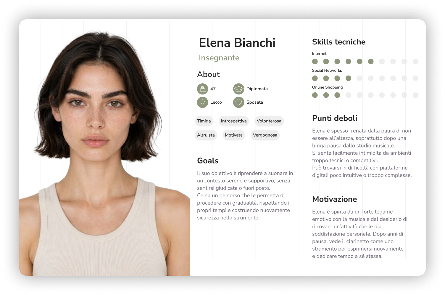
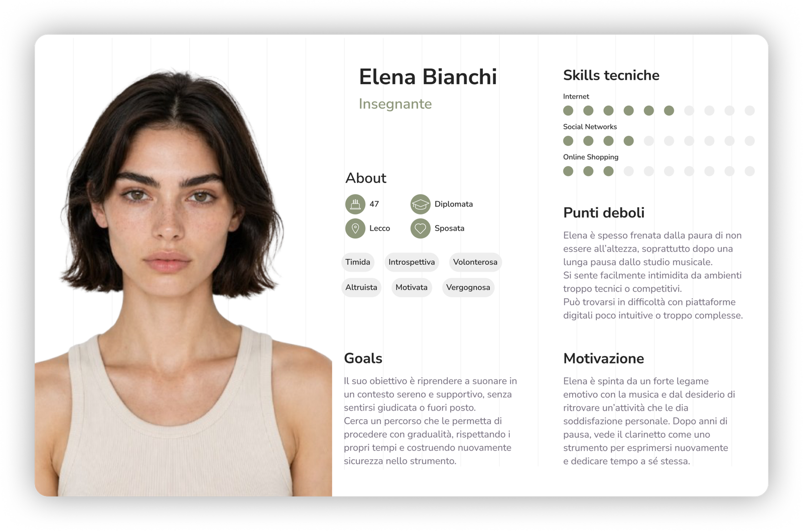
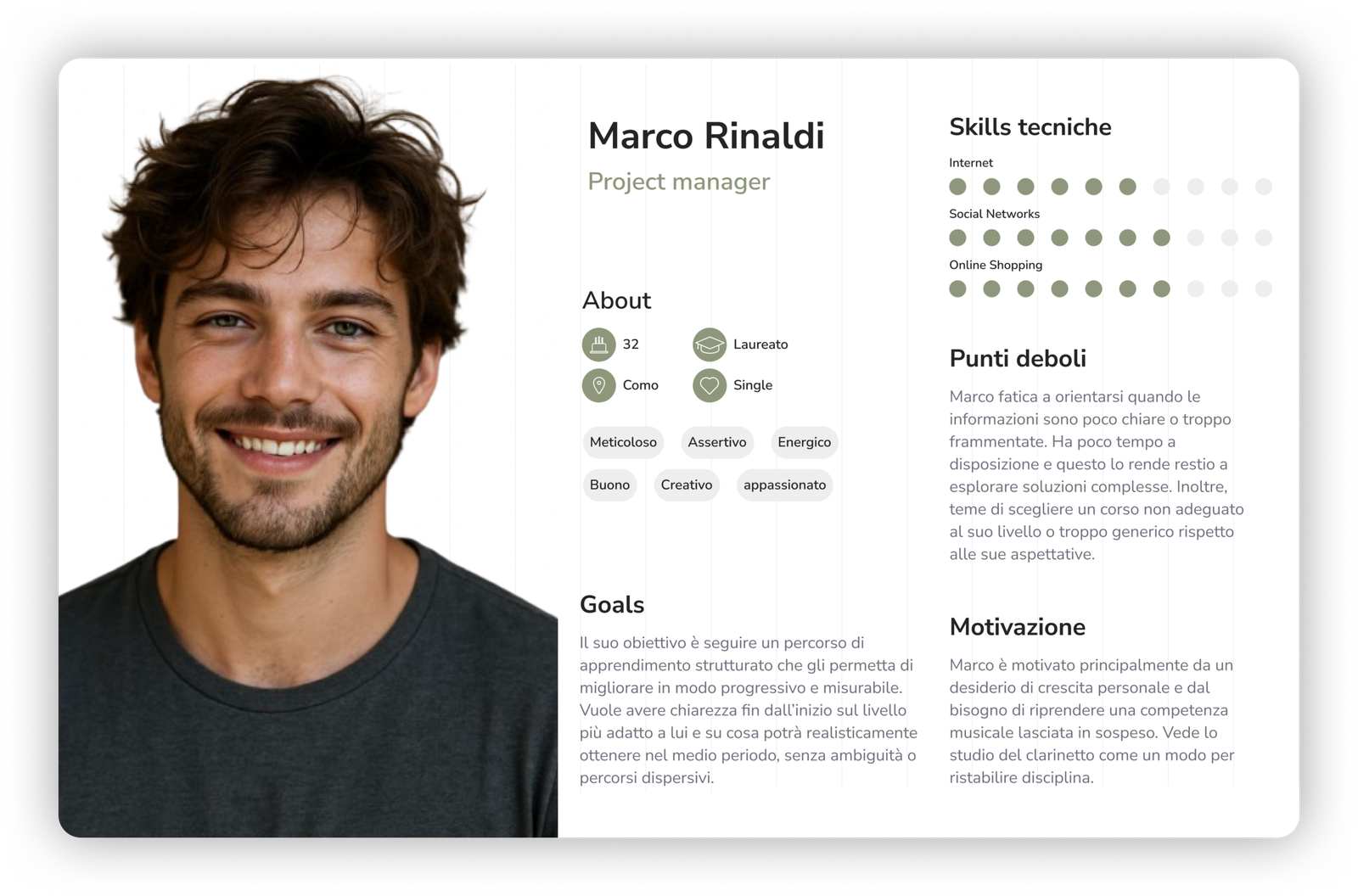
These insights were distilled into two user personas: Marco Rinaldi, a project manager looking for a course that fits his professional schedule, and Elena Bianchi, a teacher interested in deepening or picking back up her study of music. Two profiles with different needs and different levels of digital confidence, which jointly shaped the site’s tone of voice and navigation priorities.
Information architecture and user journey
Based on these insights, I built an essential sitemap, Home, About us, Course pages, Terms and conditions, Contact, designed to minimize the steps between landing on the site and reaching out to the school, in line with the requirement to prioritize calls and callbacks.
I then mapped the full user journey, from first awareness through to conversion, identifying thoughts, emotions, obstacles and design opportunities at each stage. This work made it possible to understand exactly where in the journey to place reassurance, social proof and calls-to-action, instead of spreading them evenly across the whole site.
The visual identity refresh
Since the existing brand already had its own identity, the work wasn’t about starting from zero but about a targeted refresh: making Clarinet Studio more consistent, more modern and better suited to a digital context, without changing its character.
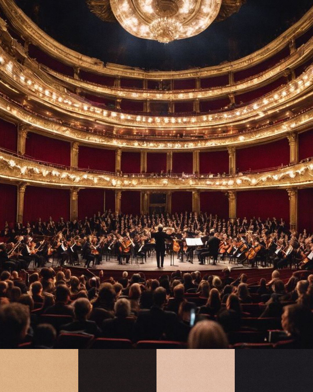
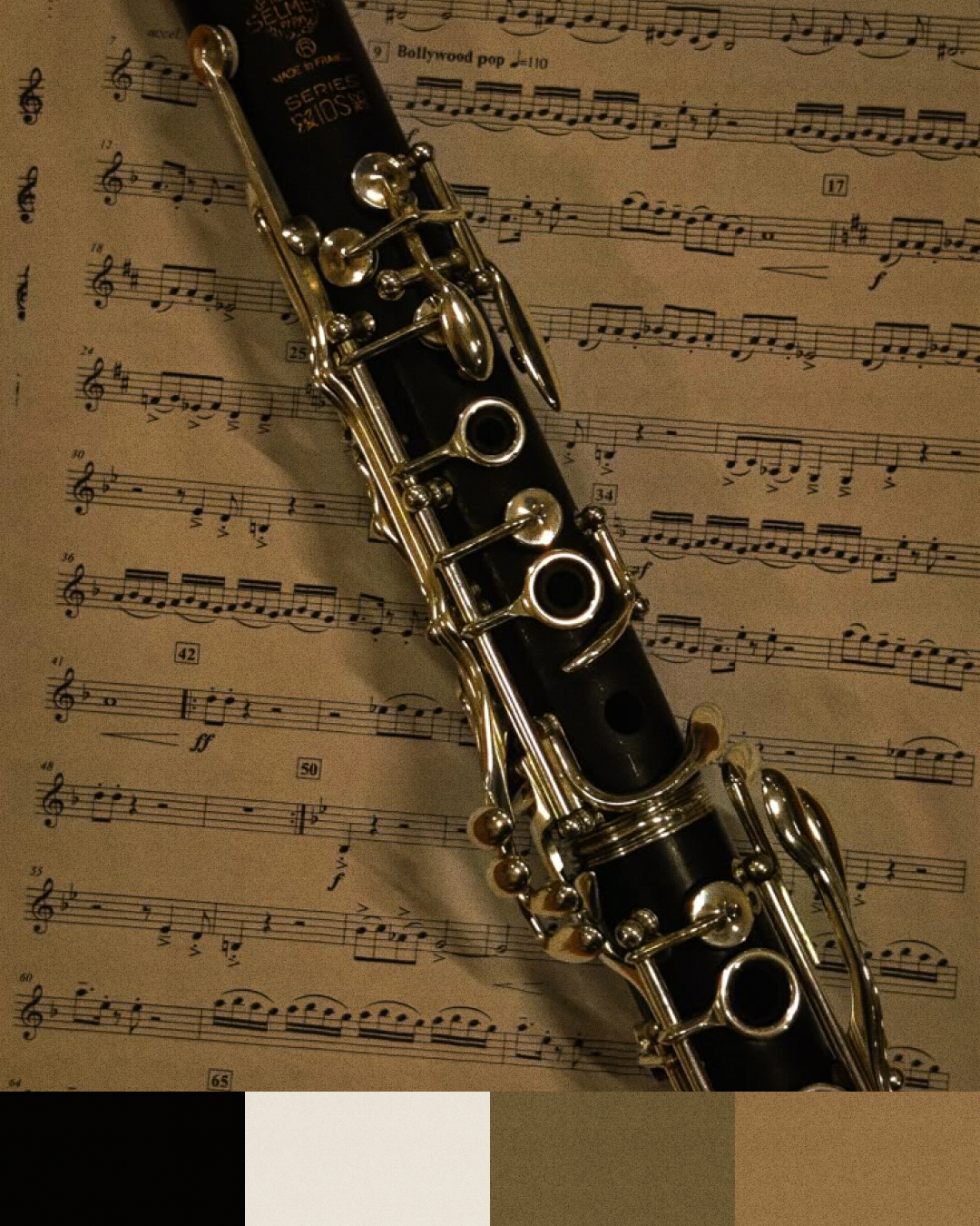
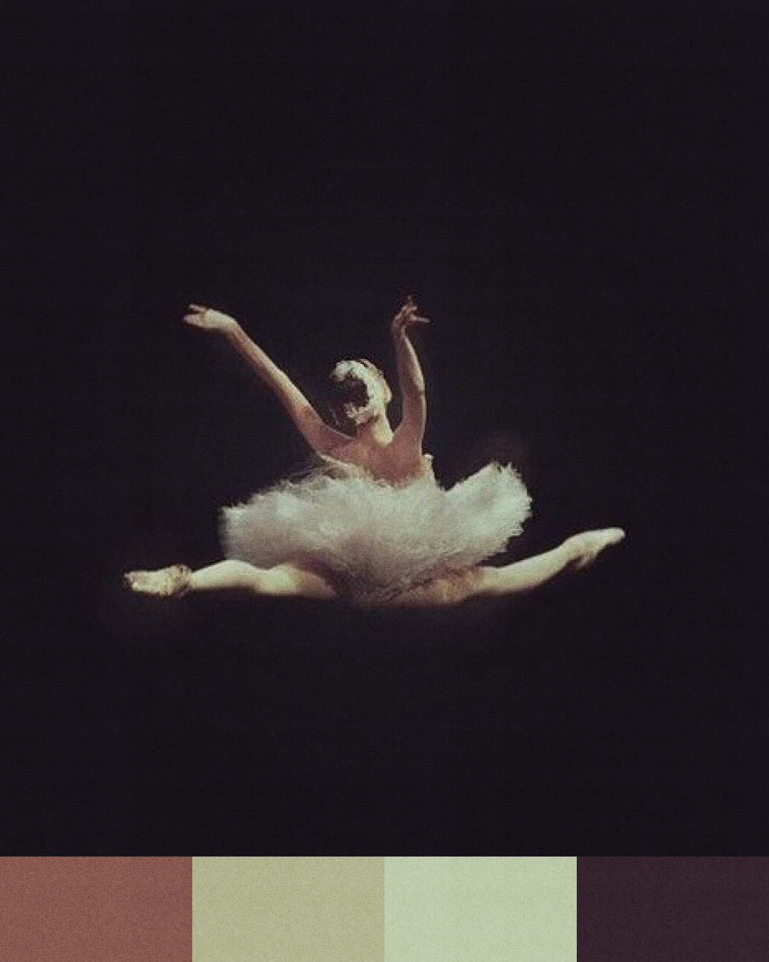
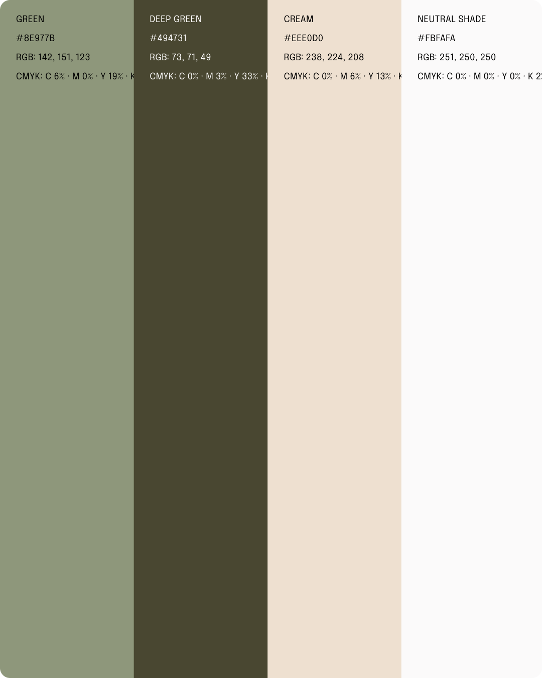
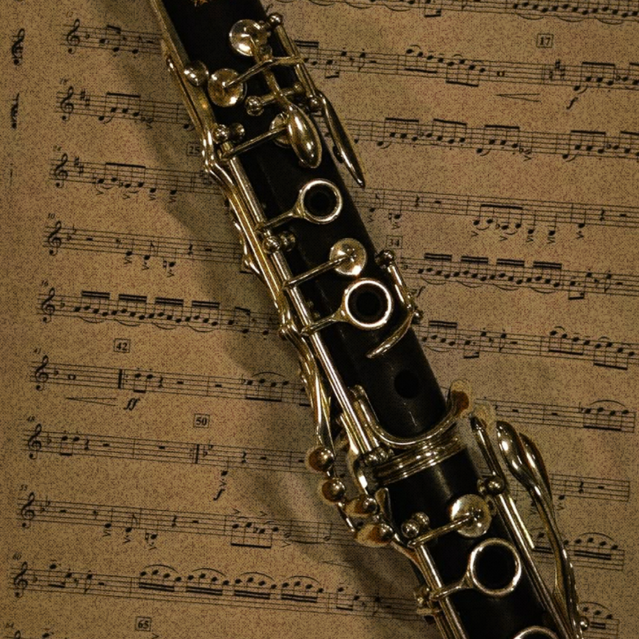
The moodboard guided the choice of a soft, natural palette, a muted sage, a darker olive green, a warm cream and a deep black, able to communicate elegance and seriousness without feeling cold, in line with the need, surfaced by the research, to balance authority with human warmth. The typography relies on an elegant, fine-stroke serif, which reinforces the school’s premium positioning while staying highly readable.
The logo was redesigned in two variants: a full wordmark, “Clarinet Studio,” for the main applications, and a “CS” monogram for contexts that call for a more compact mark, like social icons or small digital touchpoints. Both variants were built for dark and light backgrounds to ensure consistency across every touchpoint.




Wireframing and prototyping
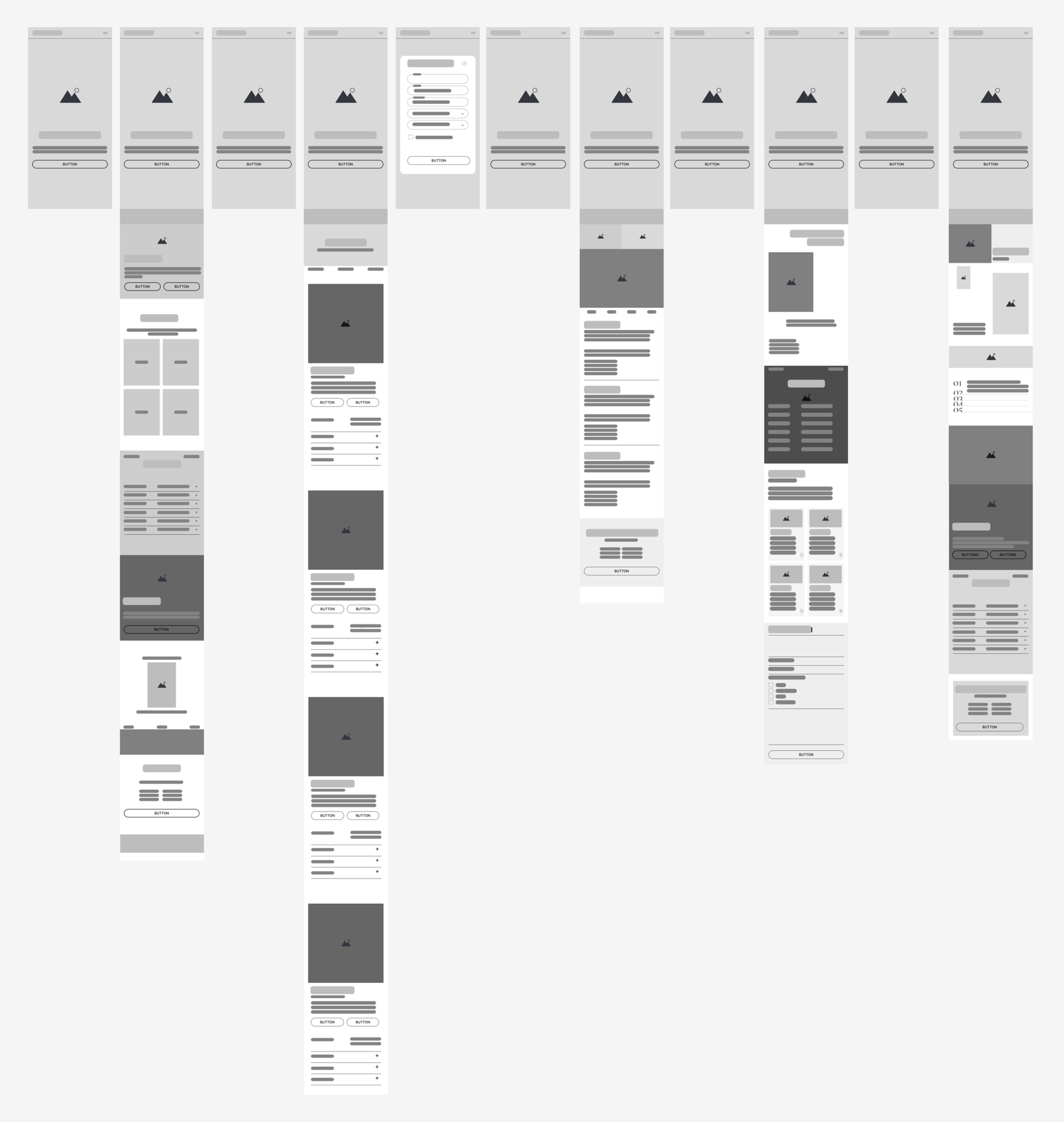
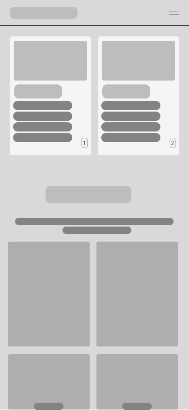
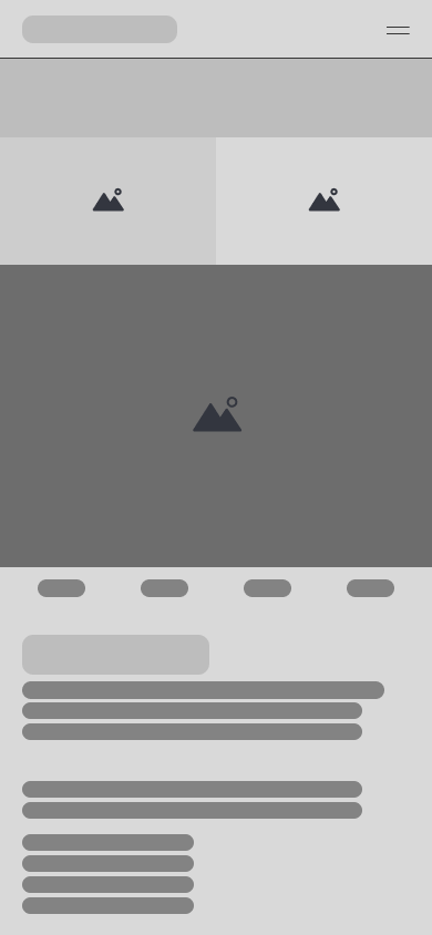
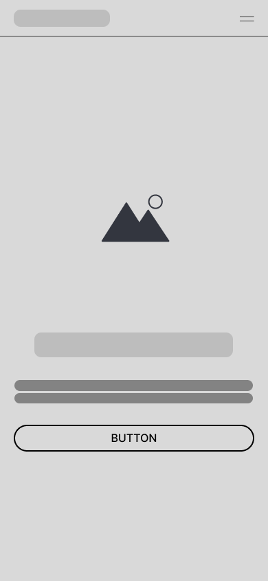
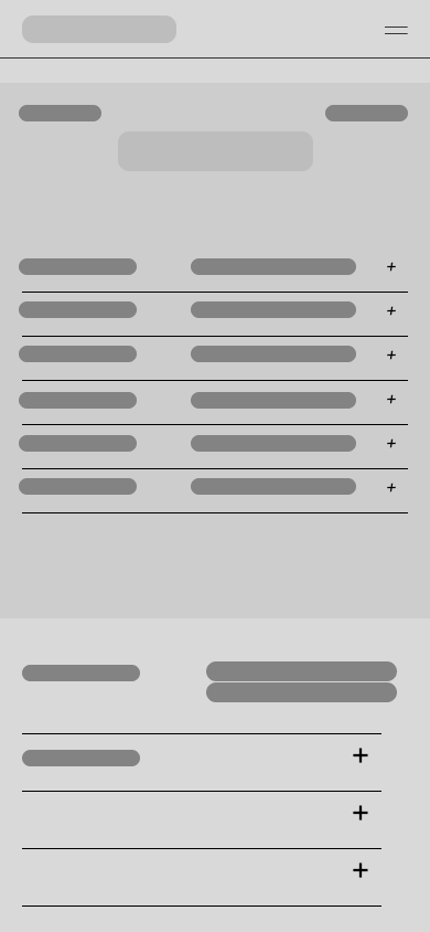
With the information architecture defined, I developed wireframes for all the site’s main pages, home, course pages, about section, FAQ, contact, working in parallel on multiple layout variants to identify, before any visual decision, the most effective structure for guiding users toward contact. This phase went through several iterations, especially on the home and course pages, to find the right balance between the amount of information more cautious users needed and the speed of access to contact the stakeholder required.
UI design: a site that communicates authority
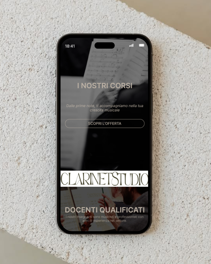
The final UI translates all of this work into an interface with a strong visual character: black and white photography of instruments and study moments, a dark, elegant layout for the opening sections, alternating with lighter, airier sections for informational content, so reading never feels heavy.
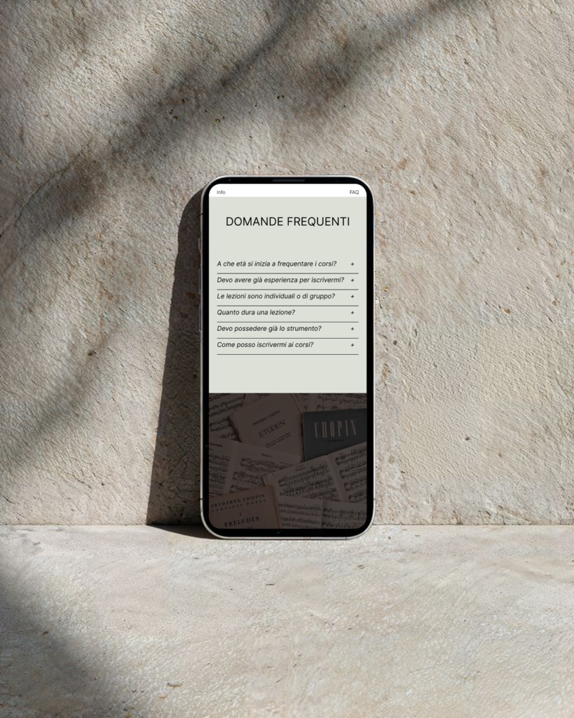
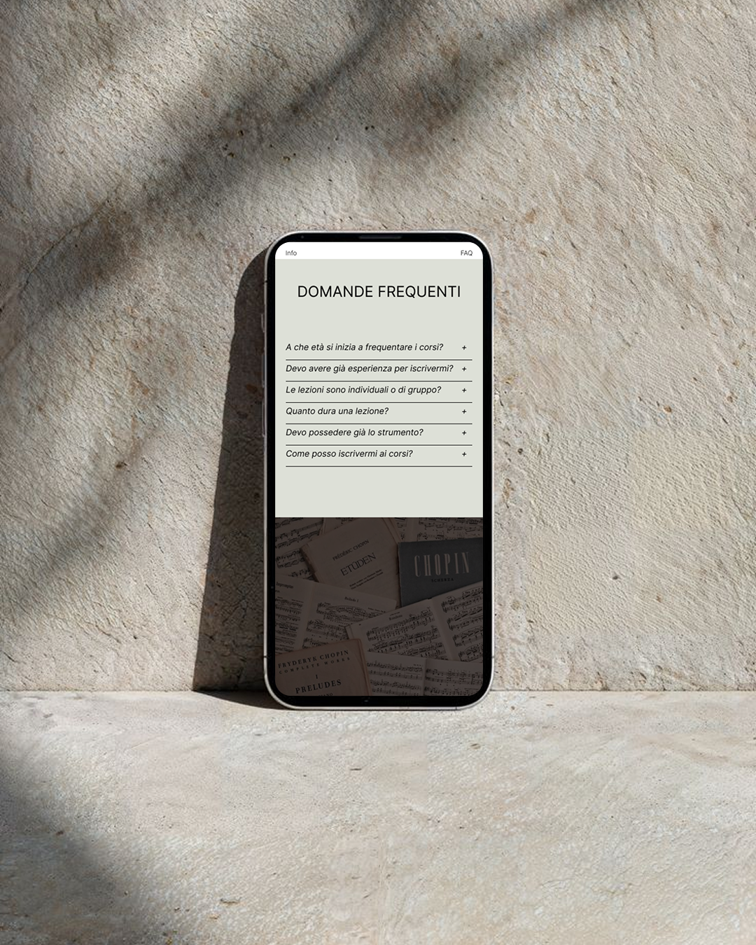
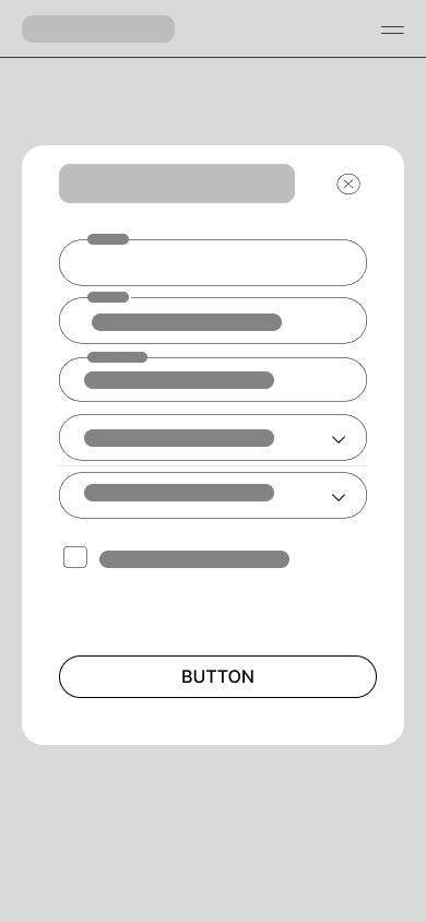
The homepage opens with a direct invitation to start playing, followed by a section presenting the school’s strengths and quickly introducing the most common questions. Every course page, violin, saxophone, piano, clarinet, follows the same structure, with a short introduction to the instrument, the most common questions handled in accordion format to reduce cognitive load, and two always-visible CTAs: “Book a lesson” and “Contact us.” Booking happens through an essential form, first name, last name, phone, instrument of interest and preferred date, designed to be completed in seconds, in line with the insight about users’ very short attention window.
The site’s more narrative sections, “An environment to grow in,” “Our story,” “Get to know us,” exist to build trust and closeness, balancing academic authority with a warmer, more welcoming tone, addressing the risk, identified during analysis, that too institutional a positioning would make the brand feel distant.
Challenges and issues encountered
Not everything about the process was linear. The main challenge was balancing the dark, elegant aesthetic chosen to reinforce the school’s premium positioning with the readability and accessibility requirements of an audience that includes less digitally confident users and older age groups: some text-to-background contrasts needed several iterations to stay elegant without compromising legibility.
Another difficulty was reconciling the starting assumption, over-40 users leaning toward phone contact, with the need to still offer a smooth online booking path for younger or more digitally confident users: the solution was to always keep the phone number visible next to every online booking CTA, instead of treating them as two separate, alternative paths. Finally, integrating photography with very different tones and expressions required post-production work to bring everything in line with the chosen palette, to keep visual consistency across the whole site.
What I took away from this
This project let me work on a very concrete case: a brand solid in substance but invisible in form, and the challenge of making visible, through digital design, a value that already existed. Research, competitor analysis and user research weren’t a formal step, but the foundation that turned every visual choice, from the palette’s tones to the structure of the course pages, into a response to a real need, not an isolated aesthetic instinct.