UX/UI DESIGN
Human-centered care Foodist
Designing an app to facilitate elderly care management for caregivers
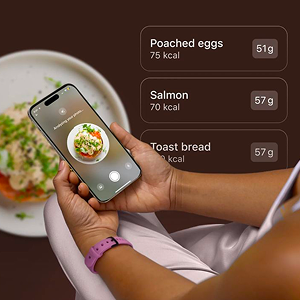

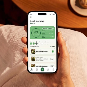
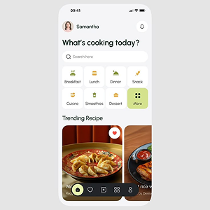
Foodist: An App to Help Caregivers Feed Their Elderly Loved Ones Better
UX Research · Interaction Design · UI Design
Academic project – Learning & Development
The project in brief
Population aging is quietly reshaping the work of millions of people who, without any medical training, care for an elderly family member every day. One of the most delicate tasks these informal caregivers handle is meal preparation: a seemingly simple activity that actually demands constant attention to the person’s food preferences, nutritional needs and overall health.
Foodist was built to answer that concrete need: an app designed to help informal caregivers prepare balanced, healthy meals for people over 65, suggesting recipes based on the ingredients already at home. The project covers the full design process, from literature research through to a high fidelity prototype validated across three iterative rounds of testing with real users.
The context: a caregiving problem, not just a cooking one
Before imagining any feature, we wanted to fully understand the context Foodist would sit in, so we started with a literature review on geriatric nutrition, caregiver wellbeing and inclusive design. This groundwork let us anchor our design decisions in solid evidence rather than intuition.
The studies we reviewed made a few things clear: elderly nutrition needs to account for factors that shift with age, like appetite, digestion and metabolism, and proper nutritional management measurably reduces the risk of frailty. At the same time, the literature on informal caregiving painted a concerning picture: family caregivers are among the groups most exposed to burnout, showing high levels of emotional exhaustion driven by constant pressure and a lack of support. A final strand of research, on inclusive design, gave us a guiding principle that stayed with us throughout the project: the difficulties people run into with technology almost always come from poor design, not from their own inexperience.
That’s where Foodist’s dual mission came from: lighten a genuinely complex daily task for the caregiver, while also safeguarding the nutritional quality and wellbeing of the elderly person.
The concept
Foodist helps caregivers diversify their loved one’s diet while keeping it balanced, reduce food waste through smart pantry management, and simplify building a shopping list.
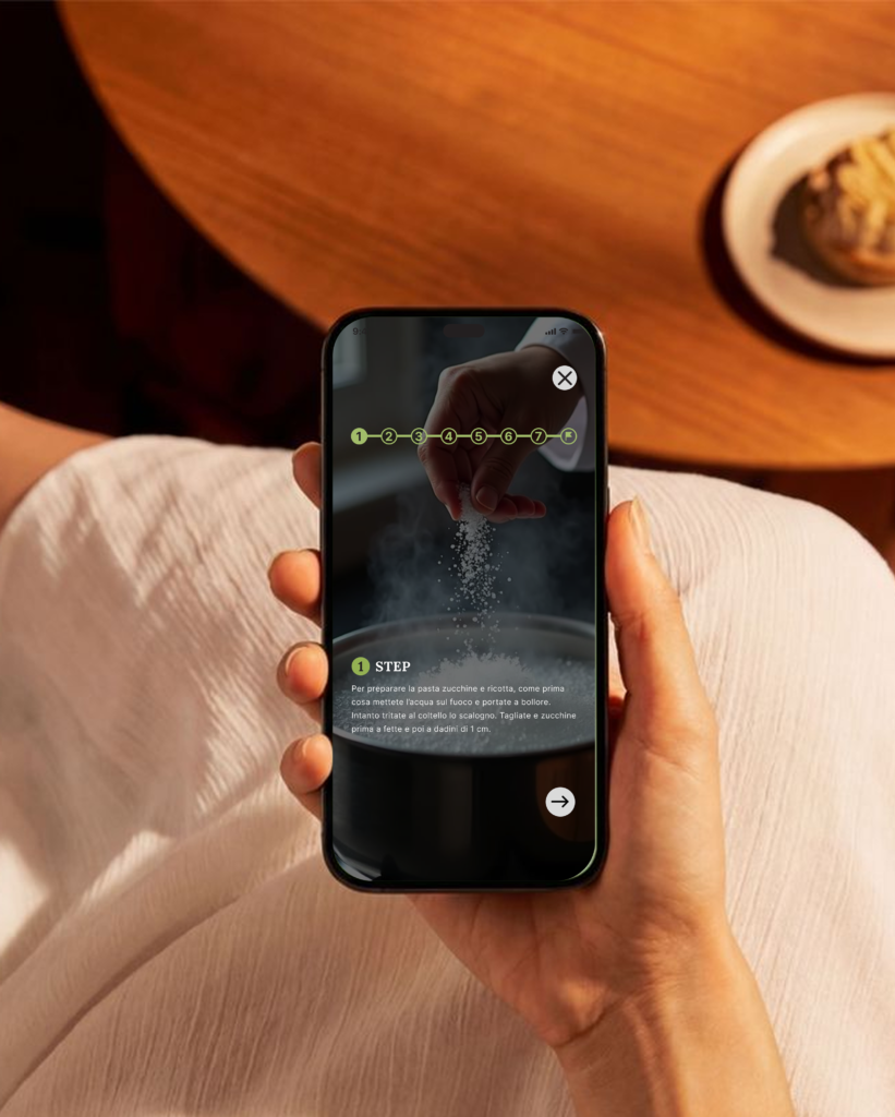
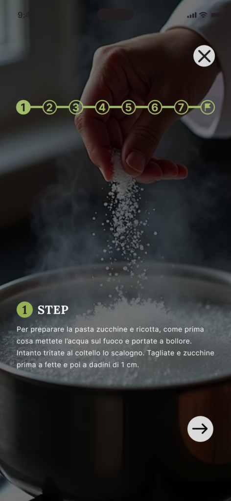
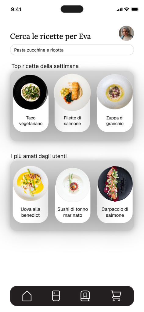
At the core of the app is a system that, starting from ingredients entered manually or by voice, returns a list of recipes that can actually be made, each paired with essential nutritional information and a step by step tutorial guiding the caregiver through preparation. Alongside this sit a notification system for grocery reminders and daily water intake, and pantry management that suggests recipes to use up ingredients before they expire.
Naming and visual identity
The name Foodist merges “food” with the suffix “-ist,” evoking an expert figure, almost a food specialist working for the user, while also echoing “list,” mirroring the app’s ingredient and shopping list management features. It’s a name that carries emotional weight too: the idea that cooking isn’t just a duty, but something made simpler and more rewarding by a quiet, attentive, dependable kitchen companion.
That same care shows up in the logo: a light, cursive font chosen to convey warmth, gentleness and closeness, instead of the coldness typical of many apps in this category. Not a small detail for an audience that often has little familiarity with technology, but still wants to feel guided and supported.


Competitor analysis
To understand where Foodist would sit in the existing landscape, we first used AI for a broad market scan, then looked directly at the App Store’s three closest applications to our idea: Frigo Magic, built for quick meals with ingredients on hand but aimed at a general audience rather than caregivers; Kitchen Stories, with a polished design and an active community, but with no attention to a caregiving context; and Meal Prep Pro, oriented toward personal fitness and health goals rather than caring for someone else.
This analysis confirmed an important gap: no existing solution combines smart ingredient management with meal preparation for elderly people on behalf of a caregiver. That open space reinforced the project’s direction, while also surfacing useful functional ideas, like advanced search filters and community sections, to reinterpret for our own context.
The design process
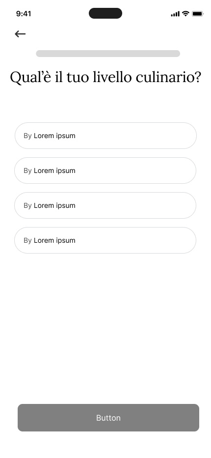
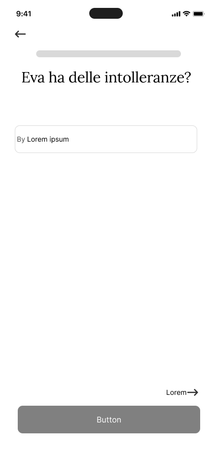
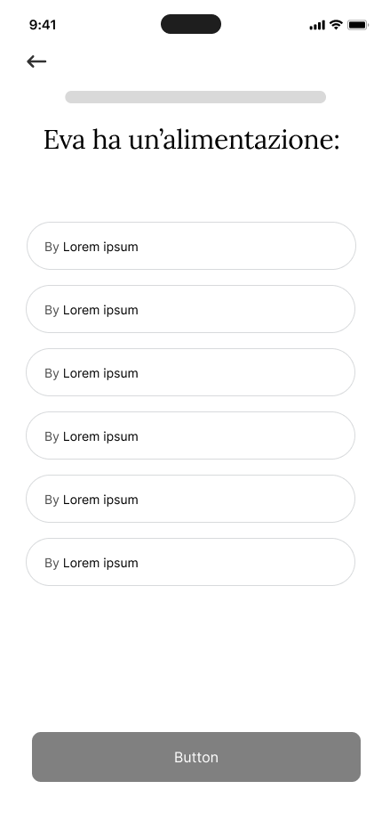
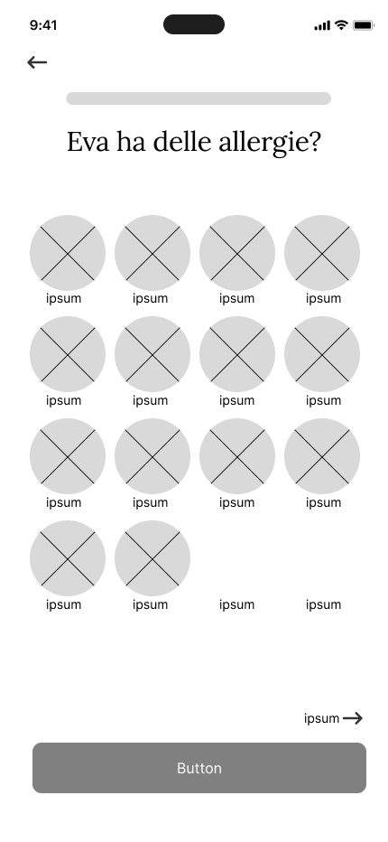
We adopted a user centered design process, built around three iterative cycles. In the first cycle we focused on understanding users through interviews, personas and a user journey, then organized the app’s features through card sorting and translated them into early sketches. In the second cycle we structured and visually shaped the product, with wireframes, mockups and a heuristic evaluation through cognitive walkthrough. In the third cycle we validated and refined the application by developing a high fidelity prototype, tested again with real users.
First cycle: listening to caregivers
Interviews and analysis: to truly understand the habits and needs of informal caregivers, we conducted qualitative interviews structured in four parts: the interviewee’s personal life and role as a caregiver, their needs around meal preparation, their relationship with digital technology, and a closing section for general feedback.
To analyze the results we applied grounded theory, identifying recurring keywords and thematic codes. The most frequent expressions, like “meal preparation,” “food waste,” “organizational difficulties” and “technological support,” clustered into four closely linked macro themes: daily cooking, organization, technology and sustainability. The thread connecting them was clear: technology becomes genuinely useful support only when it reduces organizational friction and, as a result, food waste, not when it simply adds another task to manage.
This analysis surfaced the project’s central theme: technology can be a real lever for better organization and food management in informal caregiving, as long as it stays simple and adaptable to different levels of digital confidence.
Target and personas: the target audience covers anyone who takes on the daily or frequent responsibility of preparing meals for someone over 65, with a need to save time, ensure variety and nutritional quality, and reduce food waste.
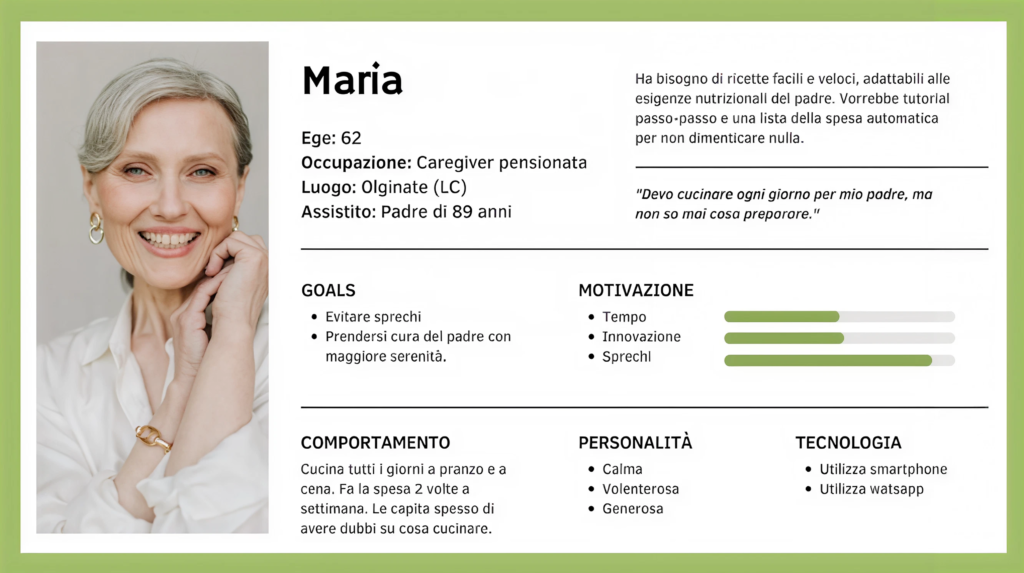
To keep the project grounded in real needs, we built three user personas representing different segments of this audience: Maria, a 62 year old retired caregiver who cooks for her elderly father every day and struggles to find variety in meal ideas; Luca, a 39 year old part time mechanic who cares for his mother on weekends and looks for practical solutions given his limited time; and Giulia, a 26 year old student who cooks for her grandmother and wants to bring more creativity and novelty to the meals she prepares. Three profiles differing in age, available time and relationship with technology, which let us design an experience able to adapt to very different needs.
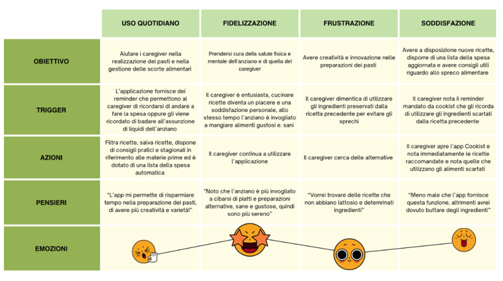
User journey, card sorting and information architecture: building on the interviews, we mapped the informal caregiver’s journey across key situations, tracking goals, triggers, actions, thoughts and emotions across four moments: daily use, loyalty, frustration and satisfaction. This work made it clear that frustration mostly stems from a lack of variety in meal ideas and the risk of wasting ingredients, while satisfaction grows when the app reduces the cognitive effort of deciding what to cook.
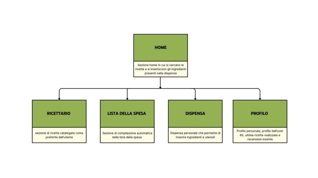
To organize the app’s features into a clear structure, we ran a semi open card sorting session, which let us both validate our hypothesized categories and gather direct suggestions from users on how to group them. This produced an essential information architecture, with Home as the entry point for recipe search and ingredient input, and four main sections: My Recipes, Shopping List, Pantry and Profile.
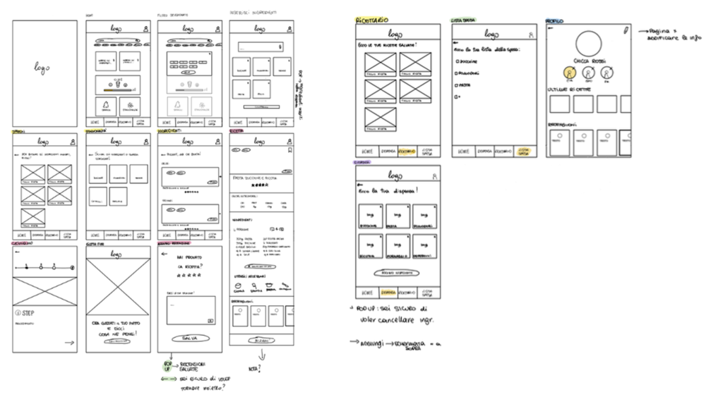
Sketches and first usability test: Starting from this structure, we produced the app’s first sketches, used as the basis for a new round of interviews using the think aloud technique, asking users to verbalize their thoughts as they explored a low fidelity prototype. The test, made up of 14 tasks with three participants, showed a strong overall understanding of the app’s structure, while also surfacing a few specific issues: the search bar felt ambiguous to users who initially confused it with the ingredient input feature, the term “Waste” read as negative, and the recipe preparation time, shown as “20 m,” wasn’t immediately clear to everyone.
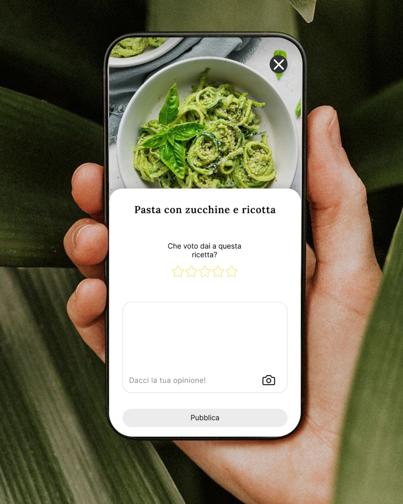
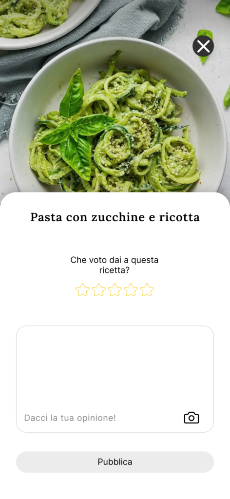
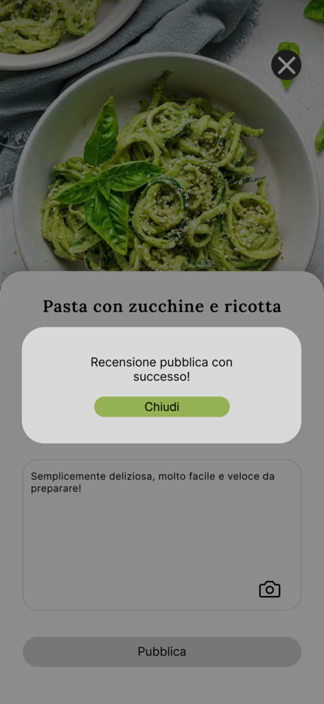
Based on these results, we made a set of targeted changes: the “Waste” section became “Zero Waste” to communicate its positive intent, the preparation time format was made explicit, the requirement to leave a review at the end of a recipe was removed to give users full freedom, and the “Recipe Book” section was renamed “My Recipes” to remove the ambiguity with a general in app recipe collection.
Second cycle: giving the product visual shape
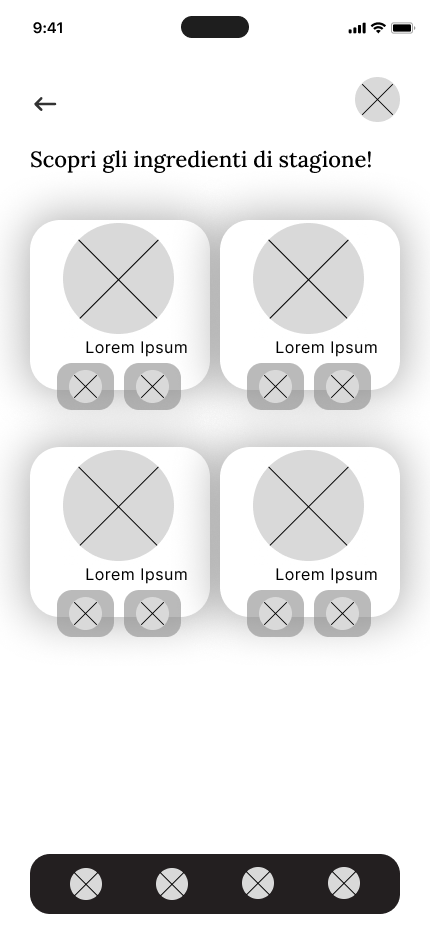
With the structure validated, we moved on to building the mockups, the stage where color, typography, icons and overall graphic style gave Foodist its visual body, shifting the focus from content organization to the quality of the perceived experience.
To evaluate this first interface, we ran a cognitive walkthrough, analyzing, for each key task, how clear the required action was, how well it matched the intended goal, and whether adequate feedback was present. This heuristic analysis surfaced a few structural issues: the review flow was too rigid with no way out, adding ingredients to the shopping list gave no visual confirmation, the pantry’s utensils section was entirely missing, and managing multiple elderly profiles didn’t allow edits or additions. Each issue identified was addressed with a targeted fix, ahead of the next round of testing.
Third cycle: from mockup to validated prototype
In the final cycle we built an interactive high fidelity prototype in Figma, substantially reworking the visual execution of the earlier mockups while keeping their underlying logic intact. The prototype was put to the test through a new think aloud session across 14 tasks with four participants, designed to check whether the changes made in earlier cycles had actually resolved the issues that had come up.
The results confirmed the overall structure held up well, but also brought new details to light: the pantry page didn’t allow adding several ingredients in sequence intuitively, navigating the preparation tutorial through the stepper felt unnatural, and the title of the personal reviews section still caused some confusion. Once again, every signal we gathered was turned into a concrete change: the pantry was reorganized into two distinct sections for ingredients and utensils with multi select, and the profile carousel was updated to show the most recently viewed recipes instead of a generic list of favorites.
The final product
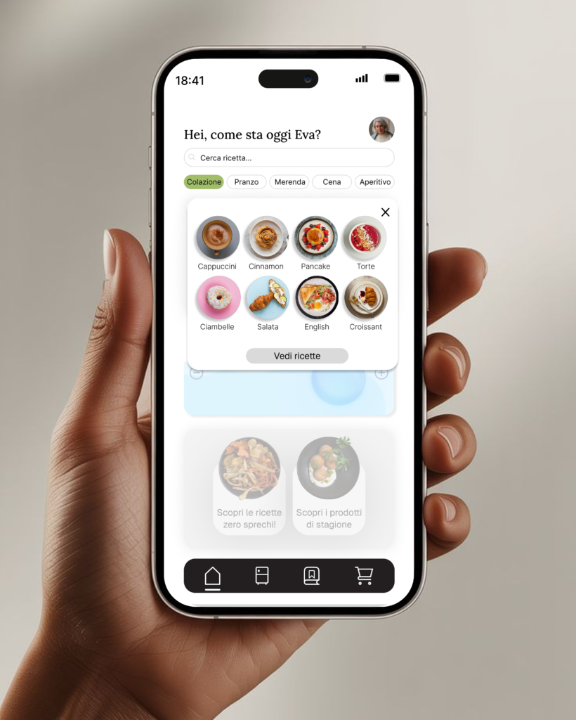
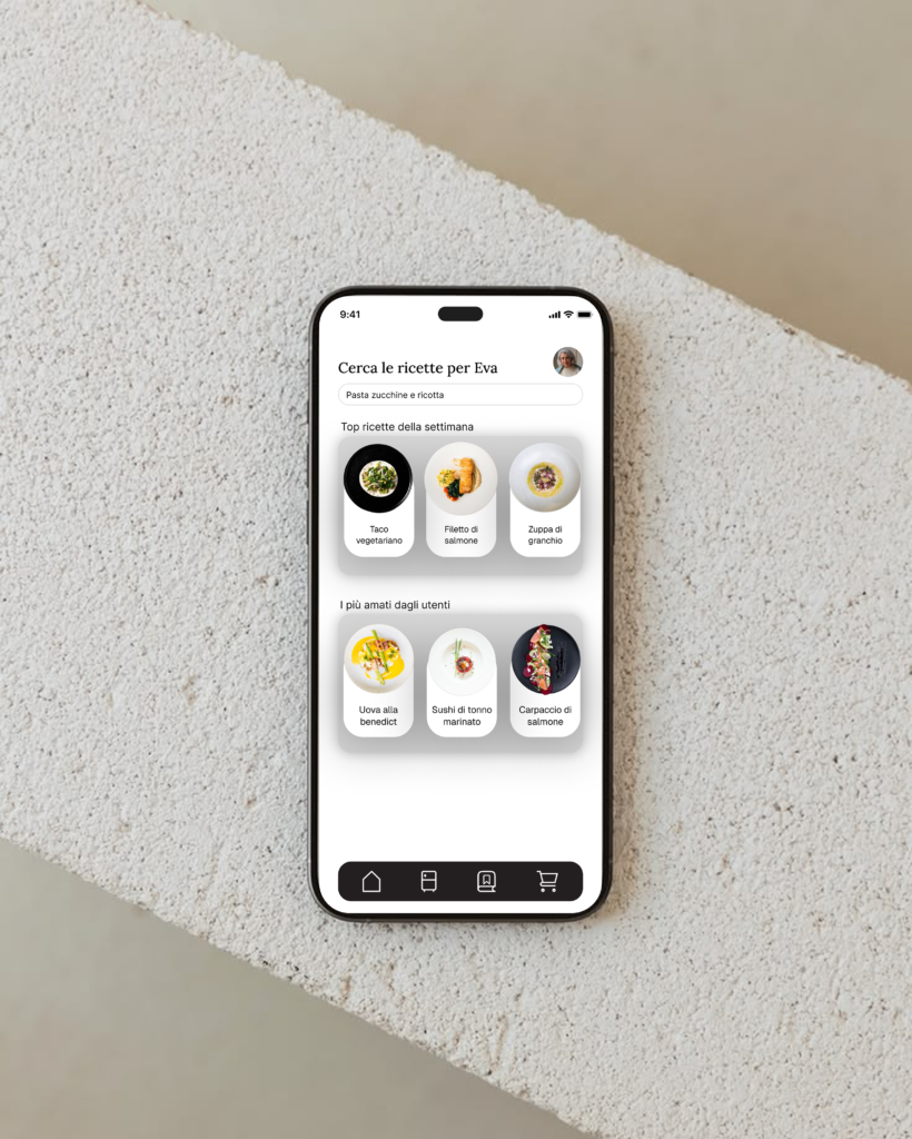
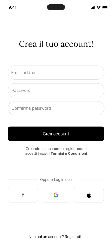
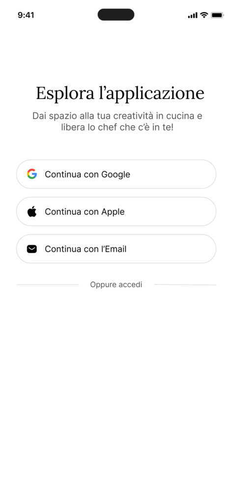
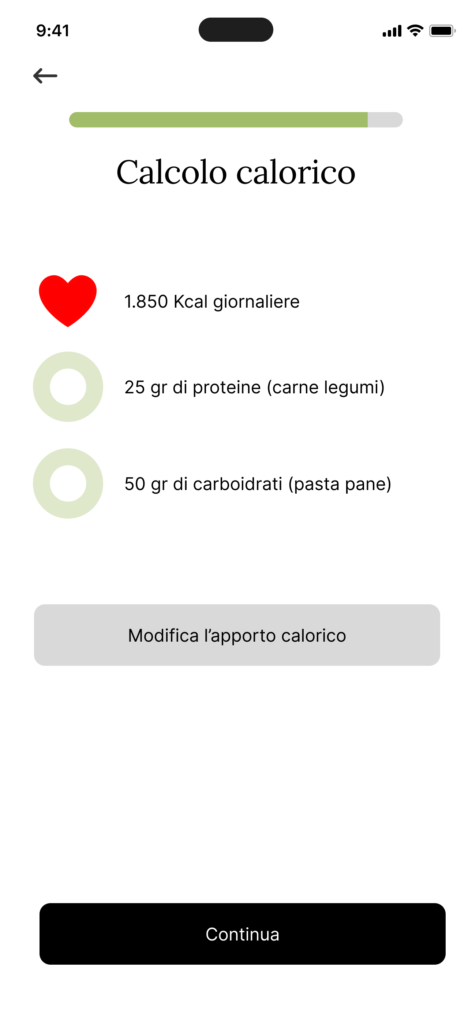
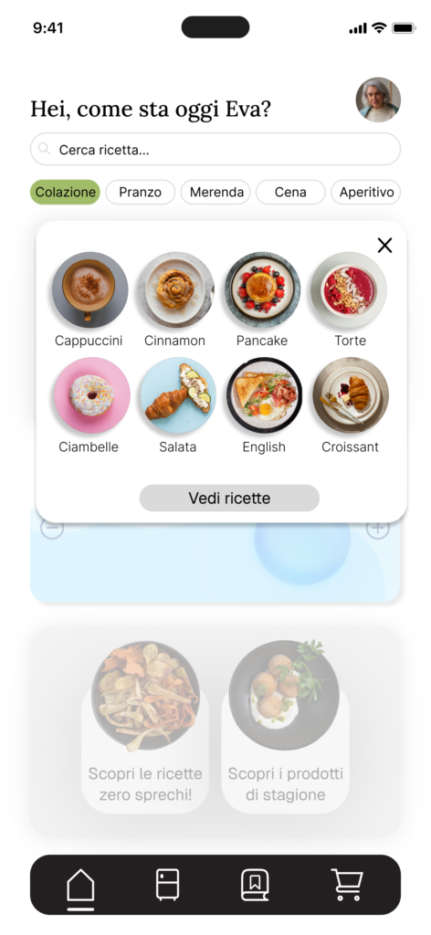
The result of this process is an application that supports the caregiver through every stage of managing an elderly person’s diet. The homepage opens with a personalized greeting and the recipe search bar, flanked by meal type filters and quick access cards to update pantry ingredients and utensils; at the center, an interactive reminder for the elderly person’s daily water intake, and at the bottom, two sections dedicated respectively to zero waste recipes and seasonal produce.
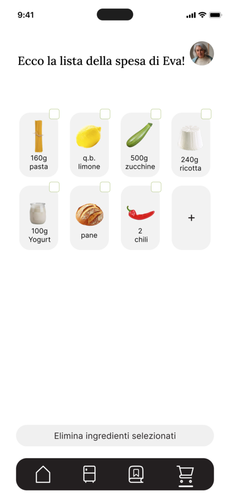
The Pantry section lets users manage ingredients and utensils in two separate category based views, with the option to immediately see which recipes can be made with what’s already at home. The Recipe page brings together nutritional values, ingredients with their quantities, required utensils, community reviews and a guided preparation flow, always accessible through a fixed button. The Shopping List collects ingredients to buy, either generated automatically from selected recipes or added manually. Finally, the Personal Profile lets users manage multiple assisted profiles in parallel, each with its own preferences, recently viewed recipes and reviews.

Future directions
This project let us dig into a real, often overlooked need, that of informal caregivers, and translate it into an application designed to feel intuitive even for people with little familiarity with technology. The iterative process, grounded in three rounds of testing with real users, let us fix not just interface details but also structural assumptions that, without direct validation, we likely would have taken for granted.
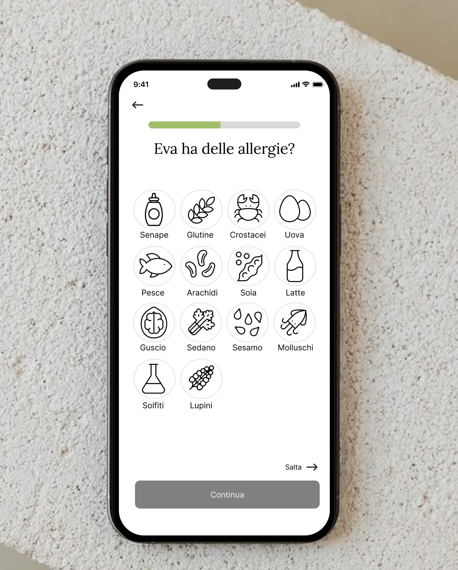
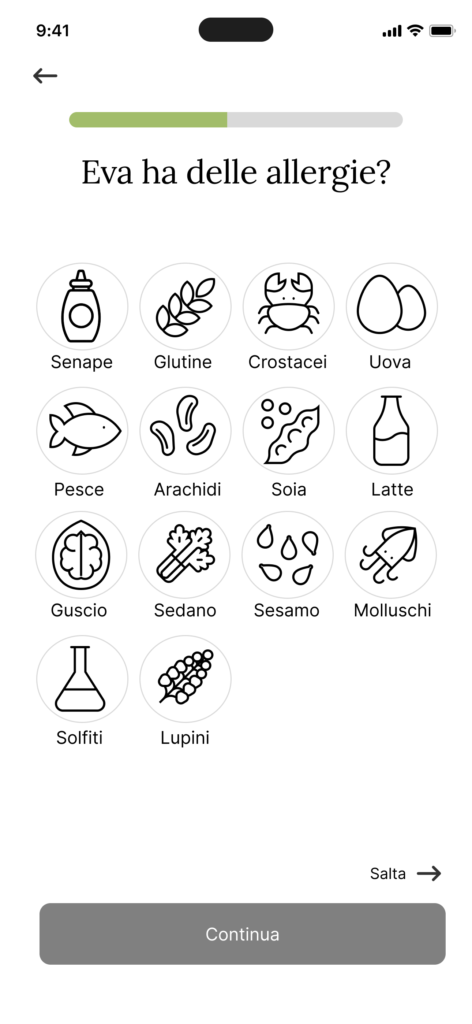
We also identified a few directions for future development: making the interaction with pantry ingredients more immediate and visually engaging, offering a quick visual indicator of pantry stock levels directly on the home screen, refining the zero waste recipe suggestions so they account for leftovers from meals already prepared, and introducing automatic filtering of recipes and ingredients based on the assisted person’s allergies and intolerances, currently only handled through a one off warning.
Conclusion
Foodist taught us how much rigorous research can reshape an initial idea. Every design decision, from the app’s name to the pantry’s structure, grew out of evidence gathered in the field, not an isolated hunch, and that’s the kind of method I consider essential in any project I work on.