UX/UI DESIGN
Beyond the bottle
Alpeswine
Rebranding project for a B2B wine company, focused on redefining its brand identity and digitalizing its communication and online presence.
AlpesWine – Rebranding a B2B Wine Business
UX/UI Design · Brand Strategy · Web Design
Real project for Alpeswine s.r.l.
The project in brief
AlpesWine is a B2B company that sources and distributes artisanal wines from small independent wineries, from Valtellina to Piedmont all the way to Sicily. A solid business, built over nearly twenty years on direct trust with its clients, but almost invisible online. This project set out to close that gap: giving AlpesWine a coherent brand identity, a distinctive positioning, and its first digital tools (website and social communication) to become known beyond its network of direct contacts.
The work started with in-depth research into the wine industry and its key players, moved through a quantitative study of consumers, and concluded with the full design of AlpesWine’s brand identity and website.
The starting point: a solid brand with no voice
AlpesWine sells well, clients are satisfied, and relationships with partner wineries work smoothly. The problem lies elsewhere: there was no channel through which a customer could discover the company on their own. No website, no social presence, no narrative. The brand grew only through word of mouth and direct contact, which limited both brand awareness and the visibility that partner wineries deserved.
Before designing anything, though, it was necessary to understand what to communicate: mission, vision, values and brand personality had never been explicitly defined. What was needed was a real rebranding, not a simple visual refresh.
The research: understanding the industry before designing
To build a solid positioning, I analyzed the main competitors in the sector: Vinicola Mauri, Partesa, Trussoni and Tannico, comparing their visual identity, tone of voice and rebranding paths. This revealed a key insight: almost every player in the category leans on a “Sage” archetype, built around authority and tradition. That left room for a bolder positioning.
Alongside the competitive analysis, I ran a survey among a sample of consumers, designed to explore perceptions and expectations toward wine retail brands and, more specifically, to test Tannico’s recent rebranding. The results confirmed a few recurring priorities, certified quality, sustainability, tradition, and showed how much a minimal, consistent visual identity is rewarded by the audience. These insights became the foundation for the strategic choices behind AlpesWine.
Strategy: a rebel archetype for a niche brand
The analysis led to a clear positioning choice: rather than competing on catalogue breadth like the larger players, AlpesWine would specialize in the quality and exclusivity of a curated selection of artisanal, non-industrial wineries, a choice well suited to its smaller scale, turning it into an advantage rather than a limitation.
On this basis I defined the brand’s mission and vision, and the most defining decision, the Rebel archetype: the only one, among the competitors analyzed, to break away from the “Sage” personality dominating the category. A direct, sincere tone of voice, deliberately distant from the polished formality typical of wine communication, built to tell the stories of small producers challenging industrial logic and to speak to an audience seeking authenticity over status.
Visual identity
With the strategy in place, the work moved on to building the visual identity, starting with a moodboard translating the concepts of craftsmanship and “rebellion” against the polished classicism typical of the category into images, and a customer persona that guided every choice that followed.
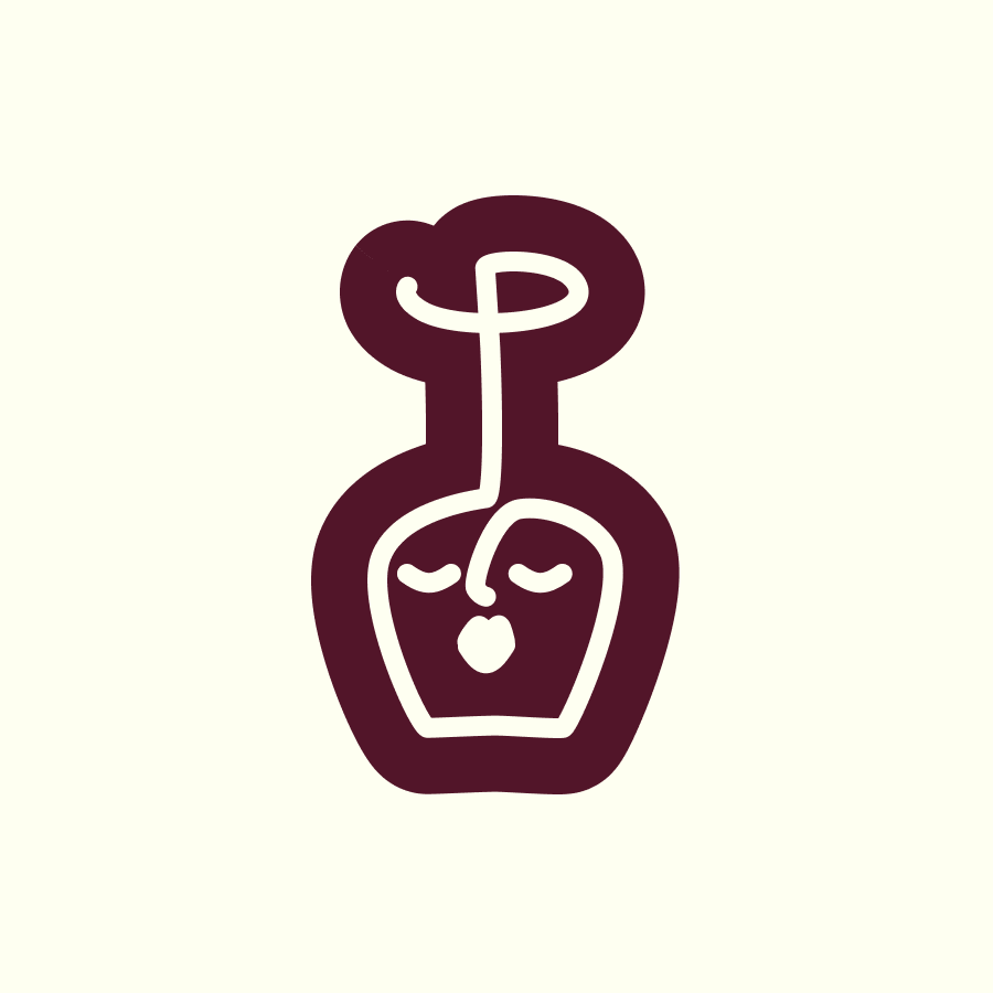
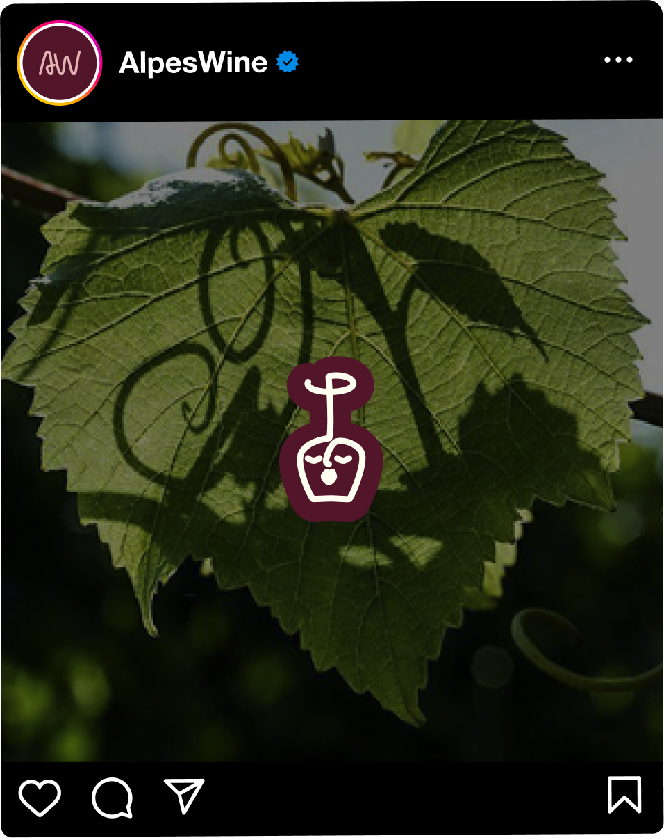
The logo combines a human profile with the silhouette of a wine glass, using soft, deliberately imperfect lines that convey a sense of craftsmanship and authenticity. The system was developed across all its variants, logomark, wordmark, combination mark and lettermark, each in light and dark versions to ensure consistency across every touchpoint.
The color palette combines an intense bordeaux, a warm pink, a luminous cream and a deep green: a range that evokes wine and vineyards while staying contemporary, versatile enough to work in both a more classic, artisanal communication and a younger, bolder one.
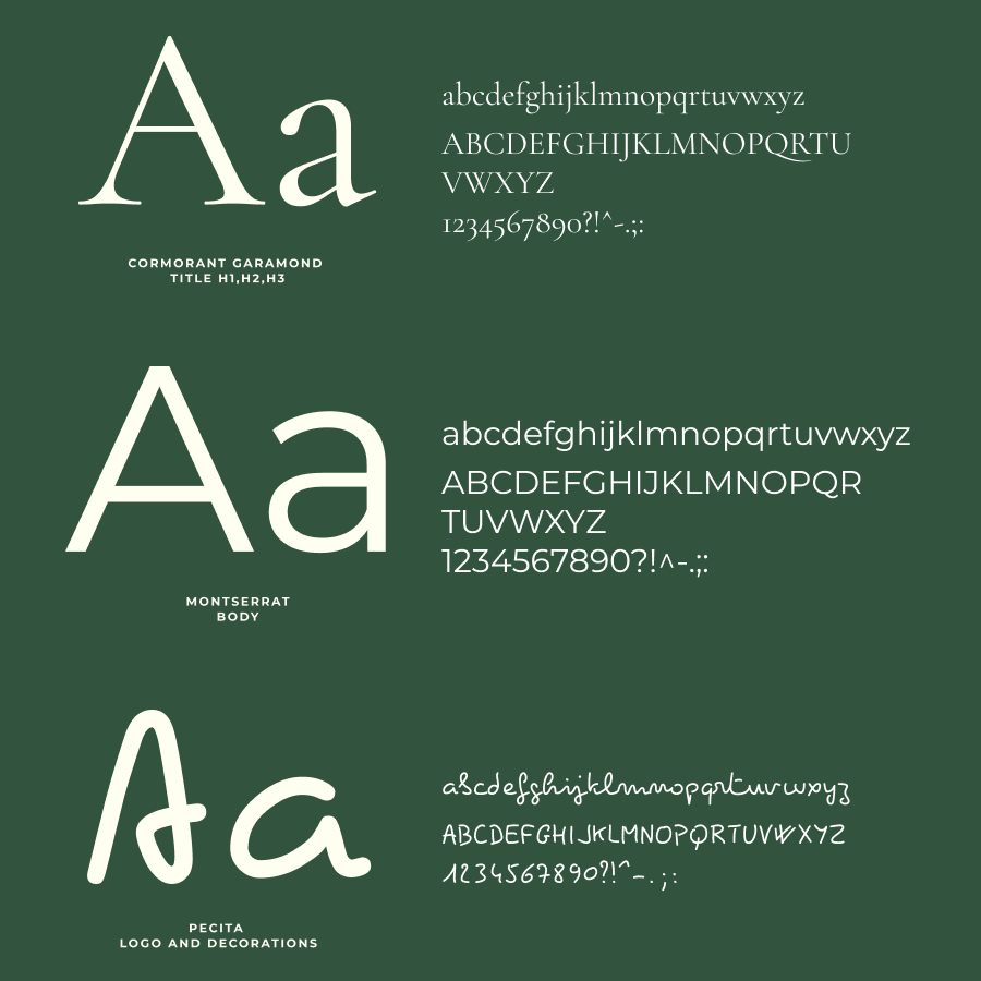
The typography relies on three complementary fonts, a solid sans serif for impact, an elegant italic for editorial accents, and a highly readable serif for longer content, a system designed to stay consistent from the website to social media to printed materials.
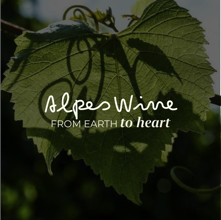
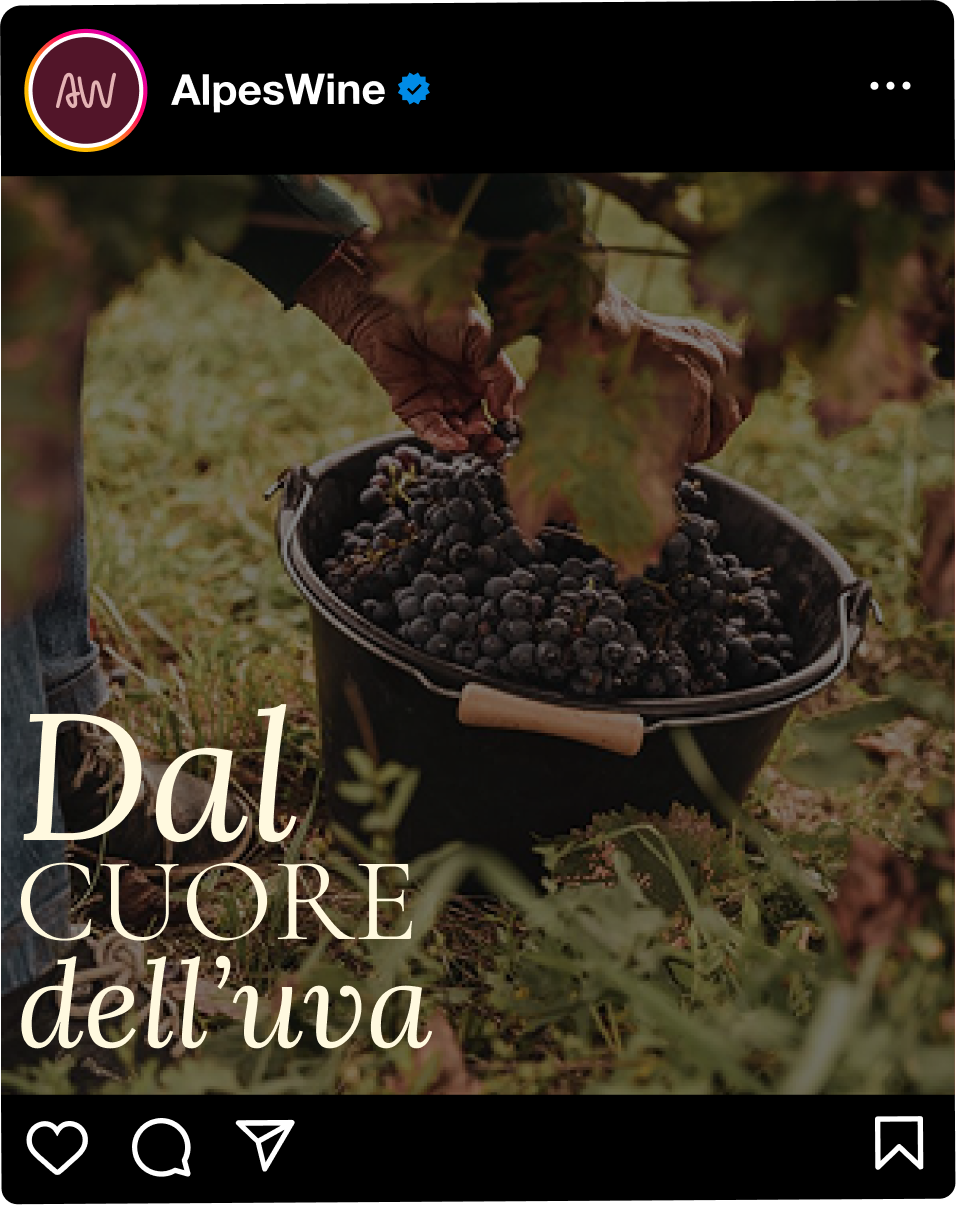
Finally, the tagline “From earth to heart” captures the essence of the project in four words: from the earth, the root and authenticity of the product, to the heart, the emotional experience wine is able to offer.
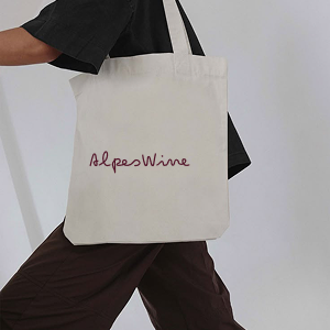
Every element was then tested across real-world applications, brochures, business cards, merchandise, to verify its consistency across different touchpoints.

Communication: giving the brand a voice
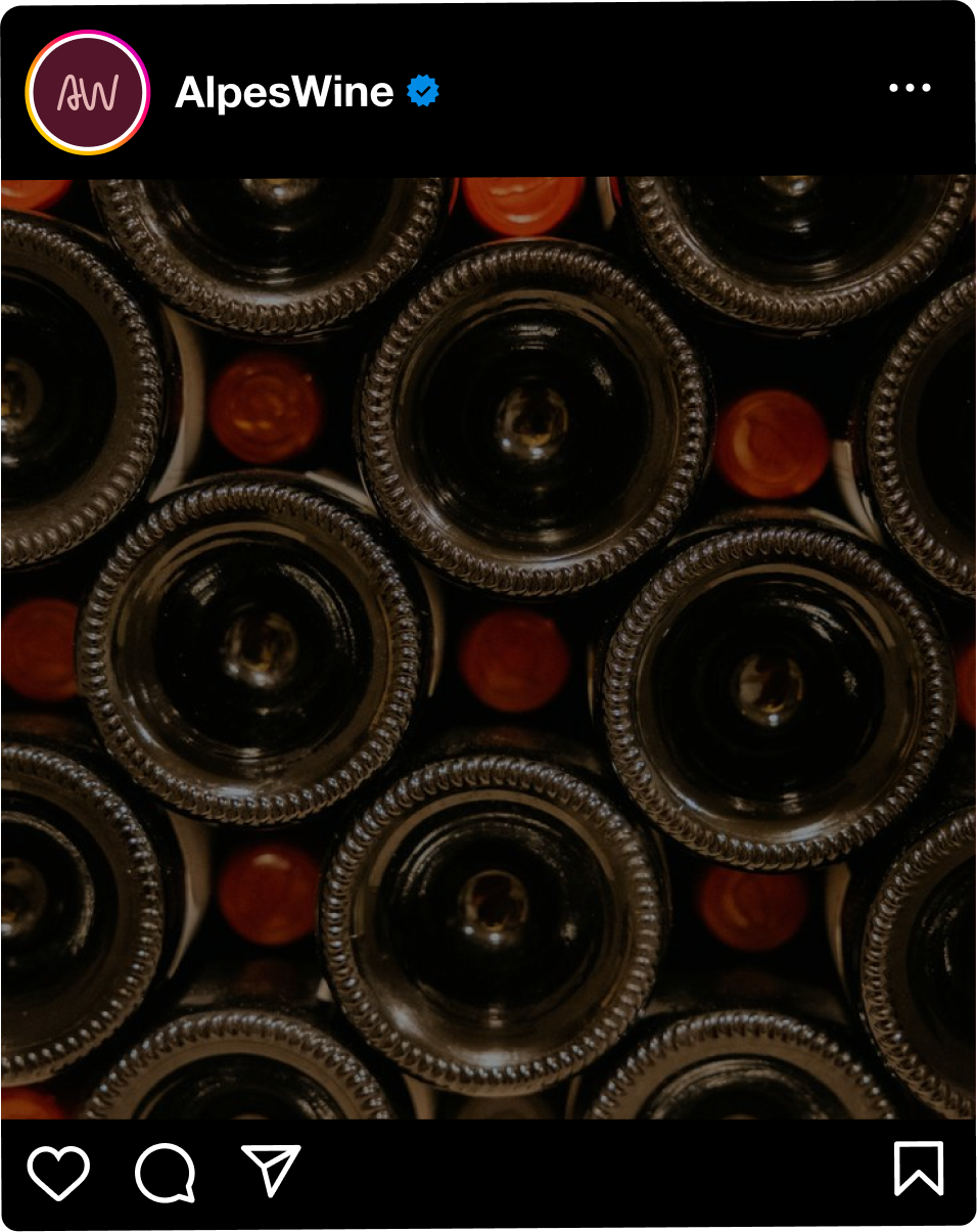
Once the identity was defined, I developed guidelines for the brand’s digital and physical presence: Instagram content alternating educational formats about wine culture with emotional storytelling around partner producers, plus place advertising concepts to strengthen the brand’s presence at physical touchpoints with its target audience, all consistent with the same direct, rebellious tone of voice.
The website: from zero touchpoints to a digital presence
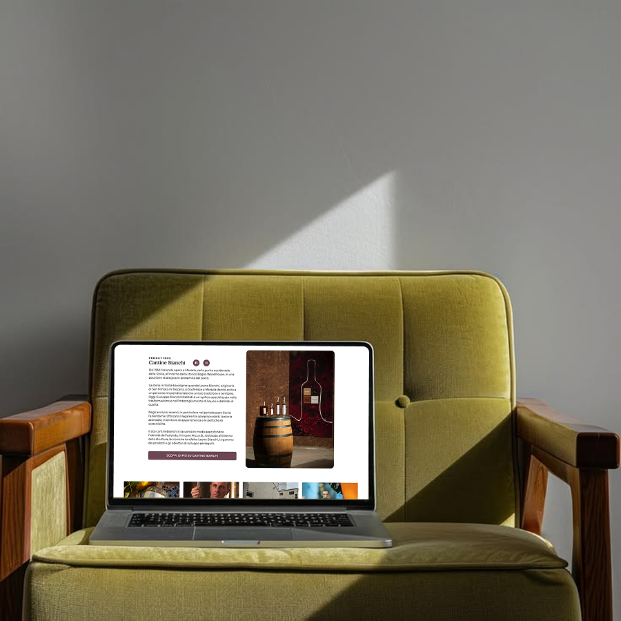
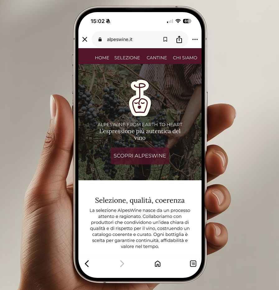
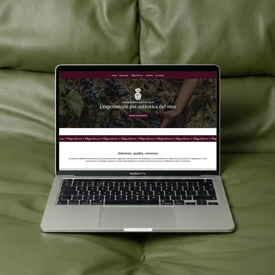
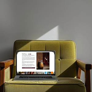
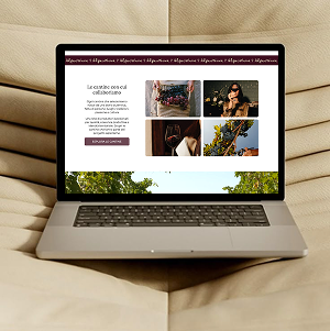
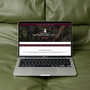
The core of the project is the design of the company website, conceived not as an e-commerce platform but as an editorial, informative space: a tool to tell AlpesWine’s philosophy and showcase its partner wineries, in line with a business built on relationships and trust rather than direct transactions.
The process followed a complete methodology: from a customer persona adapted to the website context, to the selection of icons and imagery consistent with the visual identity, through to defining the information architecture and the first layout sketches, developed ahead of implementation on WordPress.
The final outcome
he project transformed AlpesWine from a brand with an underdeveloped digital presence into a more coherent, distinctive and contemporary digital experience.
The rebranding established a stronger strategic and visual foundation, while the UX/UI work translated that identity into a structured and user-centred website.
The result is not simply a new look, it is a more coherent connection between what AlpesWine is, what it communicates and how people experience it digitally.