UX/UI DESIGN
Giving design a voice Skälboda
Designing and developing a WordPress website to promote a new product

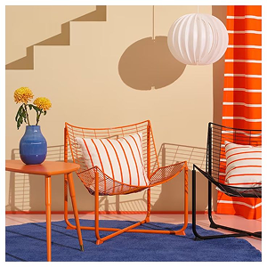
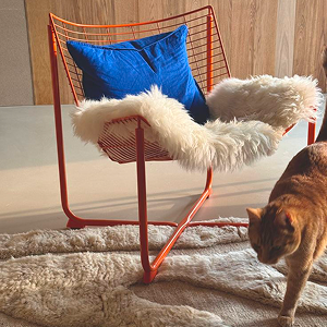
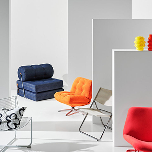
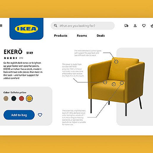
Skälboda: An IKEA Style Microsite for a New Product Launch
UX Research · UX/UI Design · WordPress
Academic project – Learning & Development
The project in brief
Skalboda is a microsite project built to replicate, at a smaller scale, the experience of an official IKEA product site, with the goal of launching and showcasing a new item designed by a creator outside the brand: in this case, a chair, the Skalboda.
The project started from an unusual brief, one that required working backward from the standard UX/UI process. The starting constraint wasn’t a platform to be chosen along the way, it was a requirement fixed from day one: build the site on WordPress. This condition flipped the usual order of design phases, turning the project into as much an exercise in methodological adaptation as one in design itself.
The brief and the starting constraint
A UX/UI project typically starts with research and information architecture, then moves to wireframes and mockups, and only at the end lands on the technical platform best suited to support those choices. In this case, the platform was already fixed: WordPress. That meant rethinking the entire workflow, figuring out which phases made sense to move ahead of the template selection, and which made more sense to push downstream, once the site’s technical structure was already in place.
That led to the decision to complete all the visual identity work, moodboard, color palette and typography, before choosing the template, so we knew exactly what to look for in a WordPress theme, instead of letting the template dictate the project’s identity.
Research and identity: thinking like IKEA
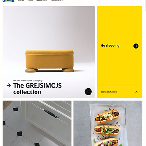
The core of the research wasn’t just about the product itself, the Skalboda chair, but about how IKEA builds its digital content for new product launches. We analyzed the typical structure of these product pages, identifying the elements users expect to find when visiting an official brand site: a clear presentation of the product and the designer behind it, information on materials and sustainability, a simple path to purchase, a news section to contextualize the launch, reviews from other users, and a direct channel to contact the company.
This research let us build a content structure that wasn’t a simple aesthetic imitation of the IKEA site, but a coherent response to the real expectations of someone browsing this type of page, an essential requirement for a project that needed to feel credible as an official brand extension.
User persona
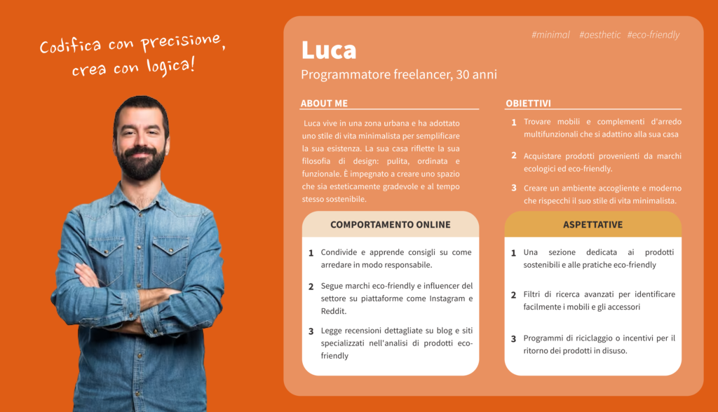
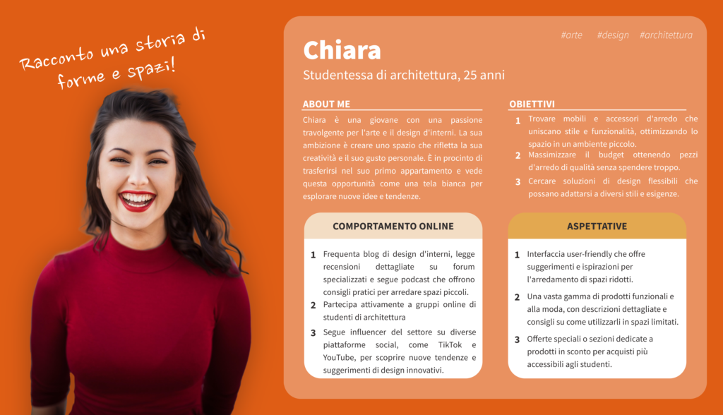
To validate our design choices, we built the persona of Luca, 30, a freelance programmer with a minimalist lifestyle that carries through into his home: clean, tidy, functional. Luca looks for multifunctional furniture and decor that fits his space, favors ecological and eco-friendly brands, and follows industry brands and influencers on Instagram and Reddit, alongside reading detailed reviews on specialized blogs before buying.
His expectations for a site like this are very specific: a section dedicated to sustainable products and eco-friendly practices, advanced search filters to easily find furniture and accessories, and recycling programs or incentives for returning unused products. These insights became concrete design requirements, shaping both the site’s content and its information structure, from a section on the chair’s material sustainability to the decision to include verified reviews as a trust building element.
Visual identity: moodboard, palette and typography
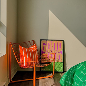
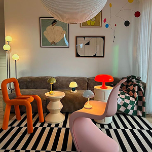
With clear content requirements in hand, we moved on to building the microsite’s visual identity, starting with a moodboard that blends the warm, natural aesthetic typical of Scandinavian furniture with a more contemporary touch, consistent with the minimalist but aesthetically demanding target represented by Luca.
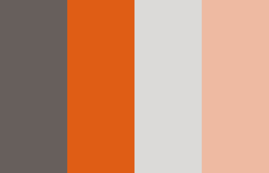
The color palette is built on four tones: a deep, warm wengé, a vivid cachi echoing wood and terracotta, a neutral light grey, and a delicate apricot that softens the combination. A palette designed to stay true to IKEA’s natural color codes while still carrying its own recognizable identity.
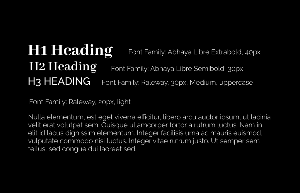
For typography, we defined a precise three level hierarchy: main headings in Abhaya Libre Extrabold, subheadings in Abhaya Libre Semibold, and a third level in uppercase Raleway Medium for labels and minor section titles. A combination that pairs the authority of a serif for headings with the clean readability of a sans serif for supporting content, keeping a visual register consistent with the brand’s premium yet accessible positioning.
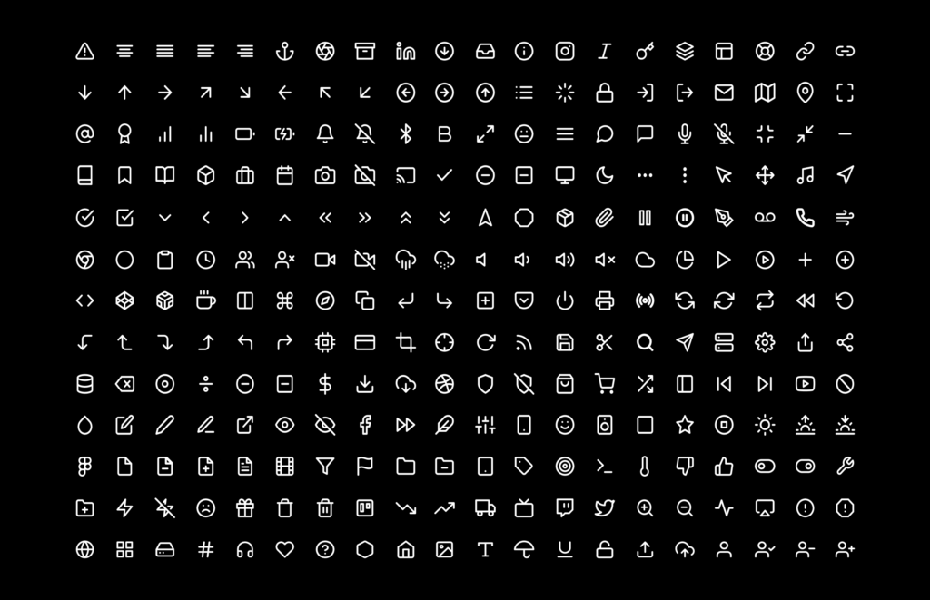
Alongside this, we selected a set of linear icons, essential and consistent in stroke weight, designed to support navigation without visually weighing down the pages, in line with the minimalist philosophy of both the reference brand and the target persona.
Sketches: exploring before choosing the template
Unlike the usual process, where sketches define a structure that’s then freely developed, in this project the sketches were made before choosing the WordPress template, with a very specific purpose: understanding the full range of content and sections the site would need to hold, so we could search for a template complete enough to cover everything identified during the research phase, without having to compromise later during development.
This step proved decisive: having a clear map of the necessary sections through the sketches, from the product page to the news section, from the contact form to reviews, let us evaluate the available WordPress templates against a precise criterion rather than simple aesthetic preference.
Template selection and site development
Based on the sketches and the already defined visual identity, we selected a WordPress template able to support every section we had identified, and moved directly into building the site, customizing it with the palette, typography and content developed in the earlier phases.
This direct development phase, which in the traditional process would only come after detailed wireframes and mockups, required constant adaptation: the template imposed a few structural constraints that made it necessary to revisit some compositional choices along the way, always keeping the content requirements from the initial research as our reference point.
Wireframes and mockups: documenting after the fact
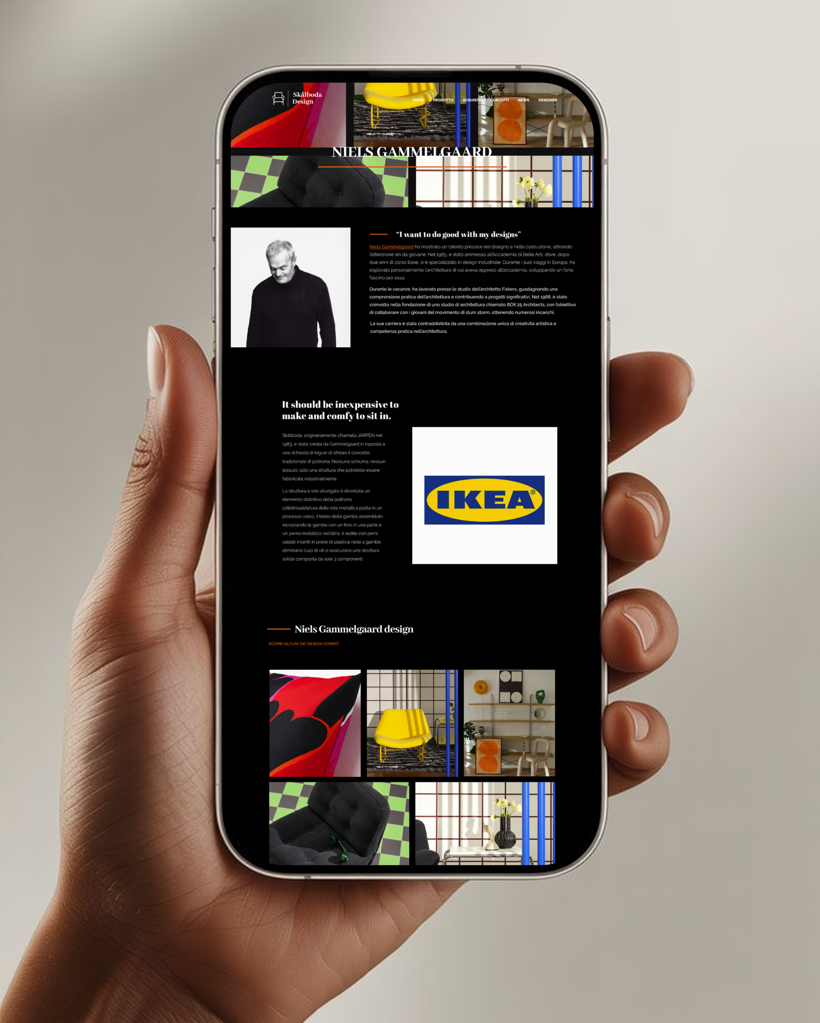
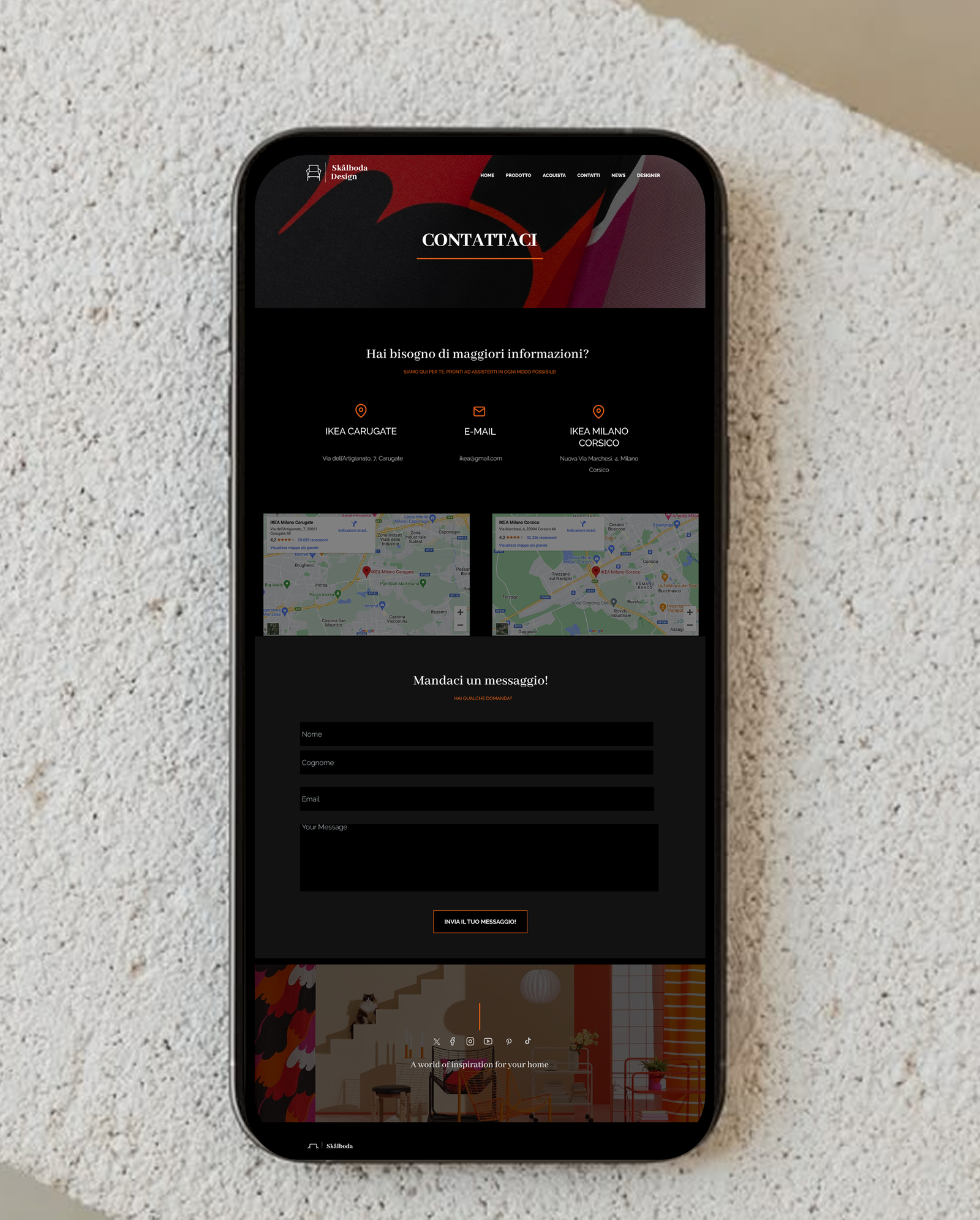
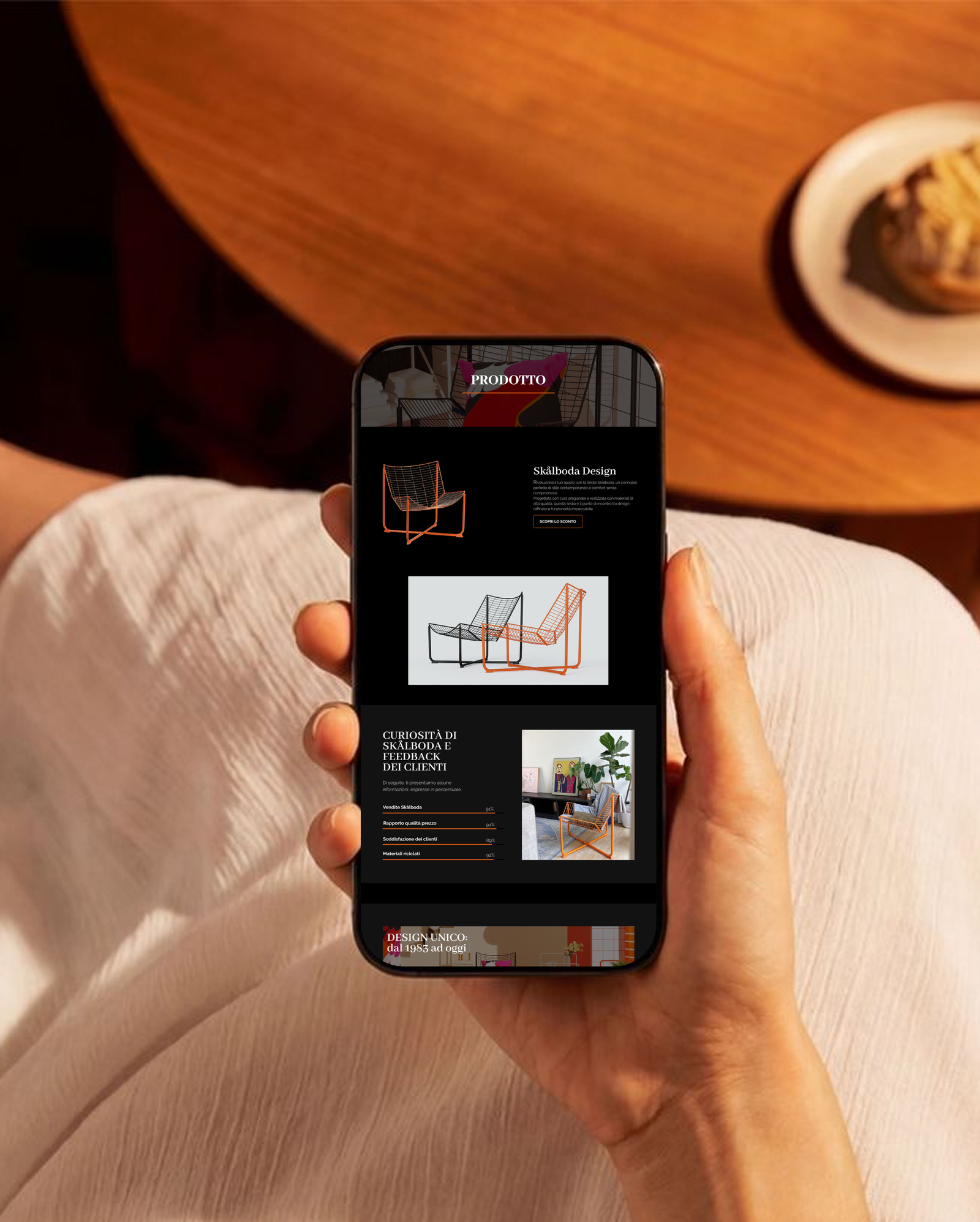
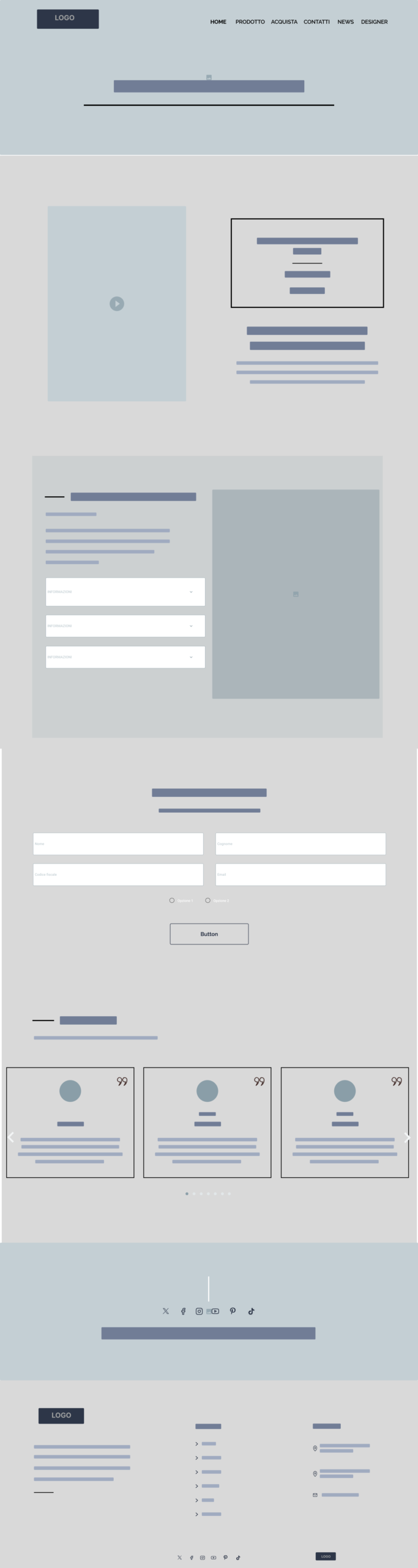
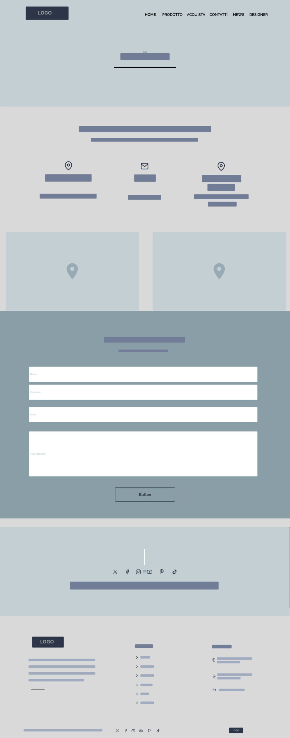
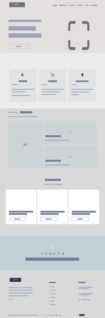
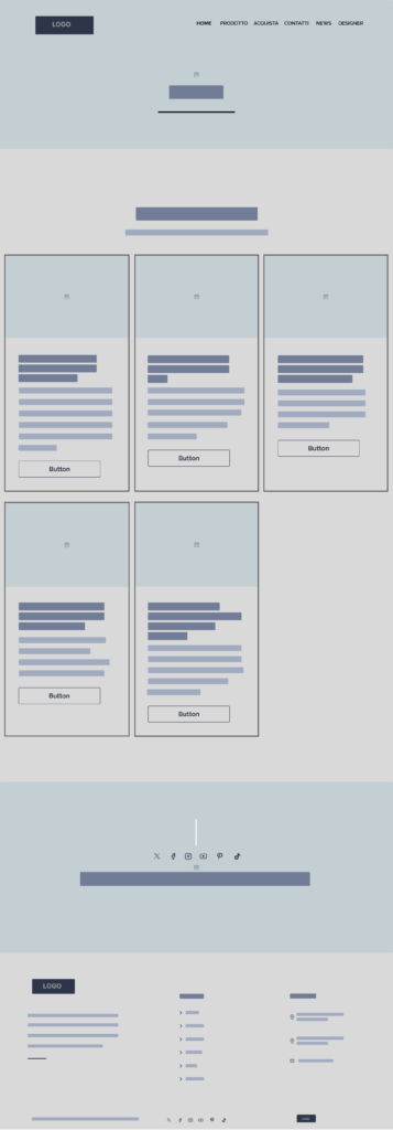
Only after building the site on WordPress did we produce detailed wireframes and mockups for the main pages, from the collection page for the new launch to the product page, from the purchase page to the news section, through to contacts and the IKEA brand presentation page.
In this project, wireframes and mockups served a different function than usual: they didn’t guide the site’s construction, they documented and refined it, letting us look critically at compositional choices already implemented, spot small visual inconsistencies between pages, and fix them before final delivery.
The final product
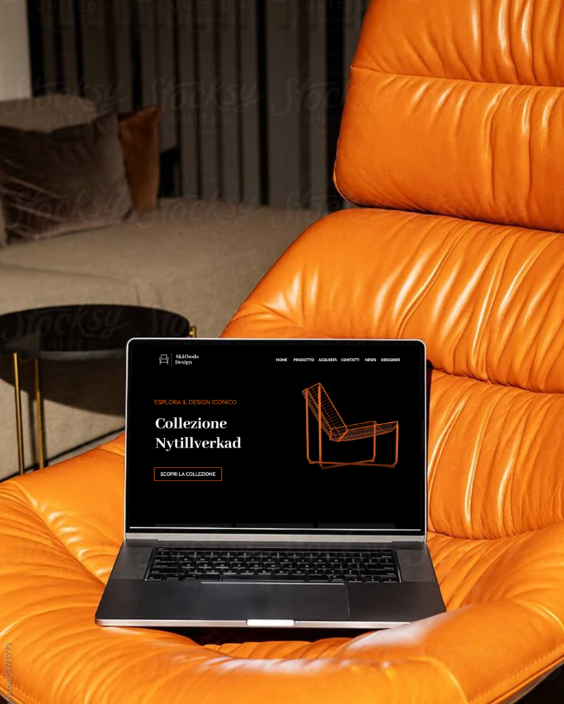
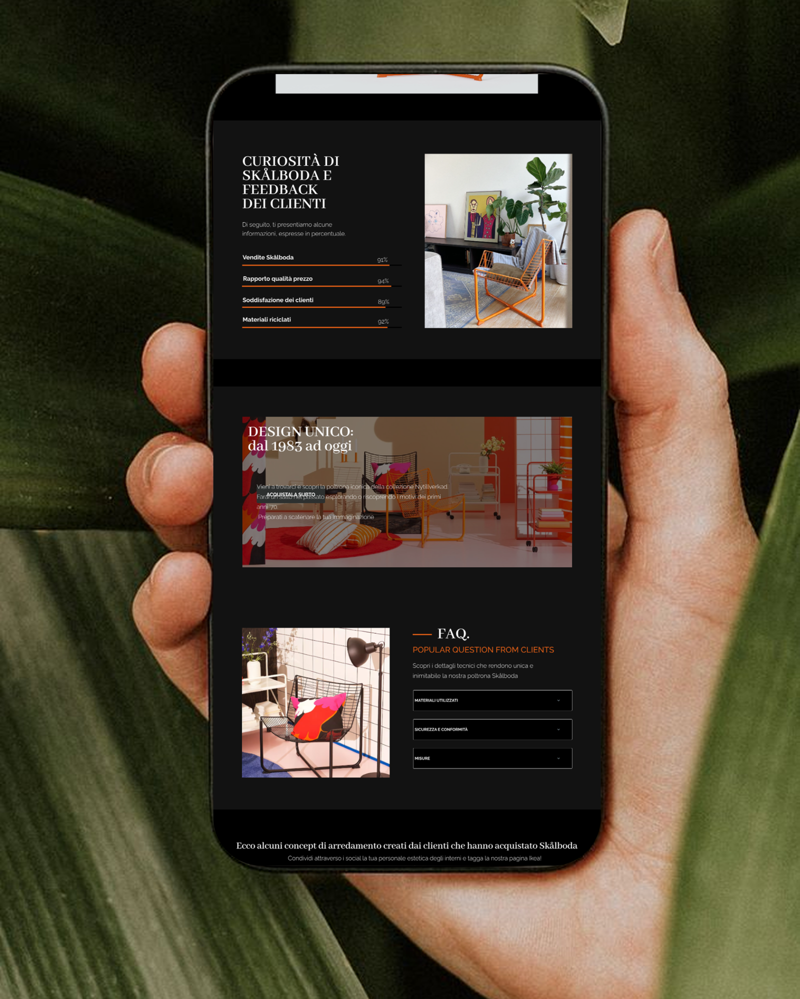
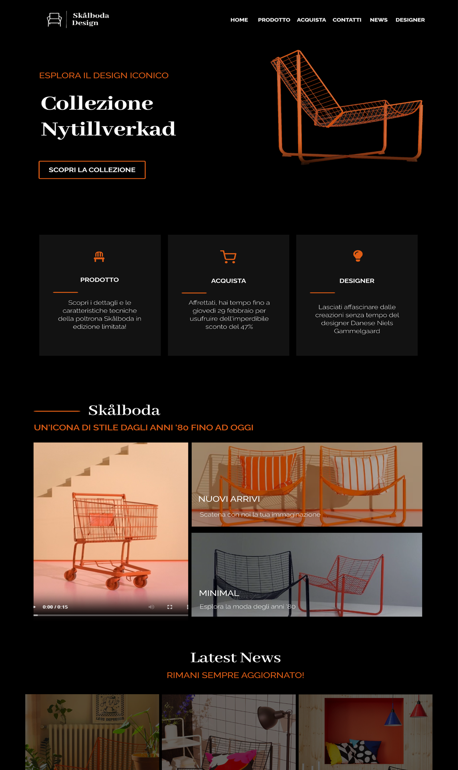
The result is a dark, elegant microsite, where the palette’s warm cachi stands out as an accent against a deep, neutral background, echoing the warmth of the product photography. The homepage opens on the collection dedicated to the new launch, with quick access to the product, purchase and reviews. The product page tells the story of the Skalboda chair alongside its design process, alongside a dedicated FAQ section and inspirational content showing the piece styled in a real living space.
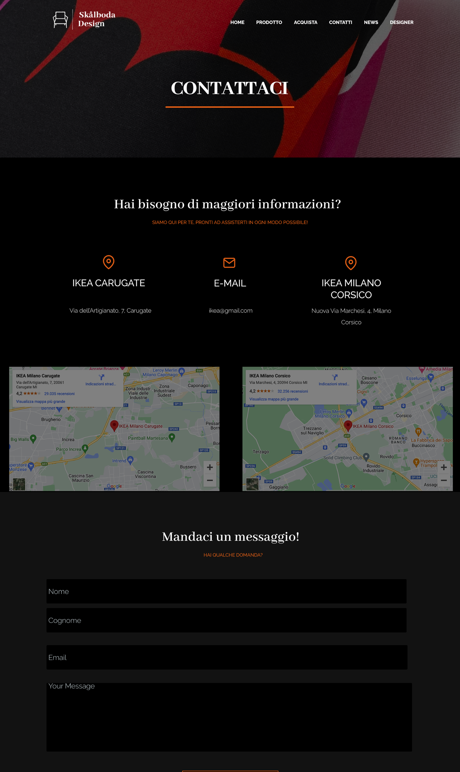
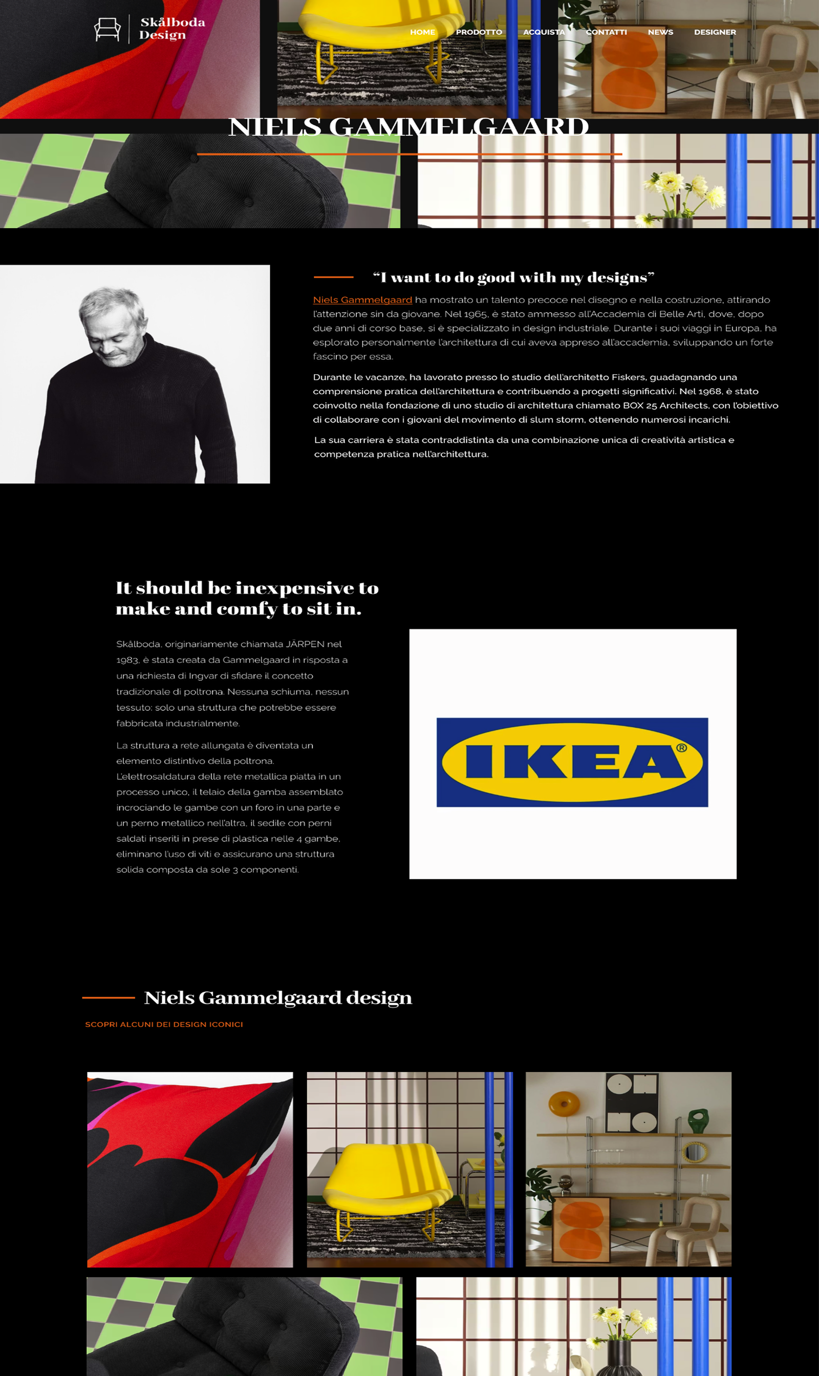
The purchase page includes a sign up form for a product presentation event and a verified reviews section, an element that directly answers the online behavior described in Luca’s persona, who is used to reading detailed reviews before buying. The news section places the launch within the brand’s broader initiatives, while the contact page offers multiple communication channels, including a map of physical stores. The site closes with a page dedicated to IKEA’s design philosophy, meant to reinforce the microsite’s credibility as a coherent extension of the original brand.
Validating the choices
Every section of the site was checked against the requirements gathered during the initial research phase, comparing the final structure with Luca’s persona goals and expectations: the presence of content on material sustainability, the clarity of the path to purchase, and the perceived trustworthiness built through the reviews section were the main criteria used to evaluate how well the final design matched the real behavior of a user who relies on multiple sources before trusting a new product.
This systematic comparison between design choices and persona needs let us identify and fix, during revision, some content on the product page that was too generic, making it more specific and consistent with the level of detail a user like Luca would expect from an official brand site.
The outcome
Skalboda was a valuable exercise precisely because it reversed the natural order of the design process: working backward, with a technical constraint fixed from the very start, forced us to be even more rigorous during research and identity work, knowing that every choice made before the template selection would have to hold up against a technical environment not entirely under our control. It’s a method I carry with me: the quality of upstream research is what makes a project solid, regardless of the order in which the phases unfold.